At Paystack (a payment service provider), the design studio team was responsible for creating a variety of graphic assets for internal use—social media posts, product launch announcements, certificates, Zoom backgrounds, and more. With time the volume of asset requests surged, causing significant challenges. To address these challenges, we created Panda, an asset generator designed to streamline the process, improve efficiency, and reduce turnaround times.
ROLE
I worked alongside a team of seven, including 2 backend engineers, a frontend engineer, a DevOps engineer, a product manager, and another product designer. My role involved conducting research, defining user flows, and designing the prototypes for Panda.
IMPACT
- Improved Efficiency: The design studio team no longer spends time on repetitive tasks, which allows them to focus on more strategic, high-value work.
- Faster Turnaround: Teams can now generate assets in minutes, reducing the turnaround time from over a day to just 5 minutes
- Brand Consistency: Panda ensures all assets generated by different teams adhere to Paystack’s branding guidelines.
THE PROBLEM
As Paystack grew, the design studio team struggled to manage the rising volume of design requests from internal teams, leading to several challenges:
- Most requests involved tweaks to existing templates, leading to time spent on mundane tasks rather than more creative, high-impact design work.
- It often took over a day to fulfill simple asset requests due to multiple rounds of back-and-forth communication, creating delays for the requesting teams.
- Non-design teams relied heavily on the design studio for assets, which slowed down their workflows and added unnecessary pressure on the design team.
- Occasionally, teams that bypassed the studio created assets that didn’t align with Paystack’s branding guidelines.
GOALS
To solve these problems, we set three key goals for Panda:
- Automate and simplify asset creation to free up the design studio team for more impactful creative work.
- Drastically reduce the time it takes to create assets, enabling teams to get what they need in minutes rather than days.
- Enable non-designers to create their own assets independently while ensuring everything aligns with Paystack’s brand guidelines.
RESEARCH
The design studio team shared a detailed brief sharing the issues they had been experiencing, and what they envisioned Panda to be. Based on the brief they shared, we created a list of assumption statements. We were assuming that;
- Our target users were the design studio team, and Stacks (non-designers in other teams within Paystack)
- The Stacks wanted faster turn-around time for their design requests.
- The design studio team wanted to spend less time working on repetitive tasks.
- The design studio team wanted to make sure that every design sent off was good enough and consistent with the Paystack brand.
- Users needed multiple sizes of posters for different touchpoints (banners, social media, billboards, etc)
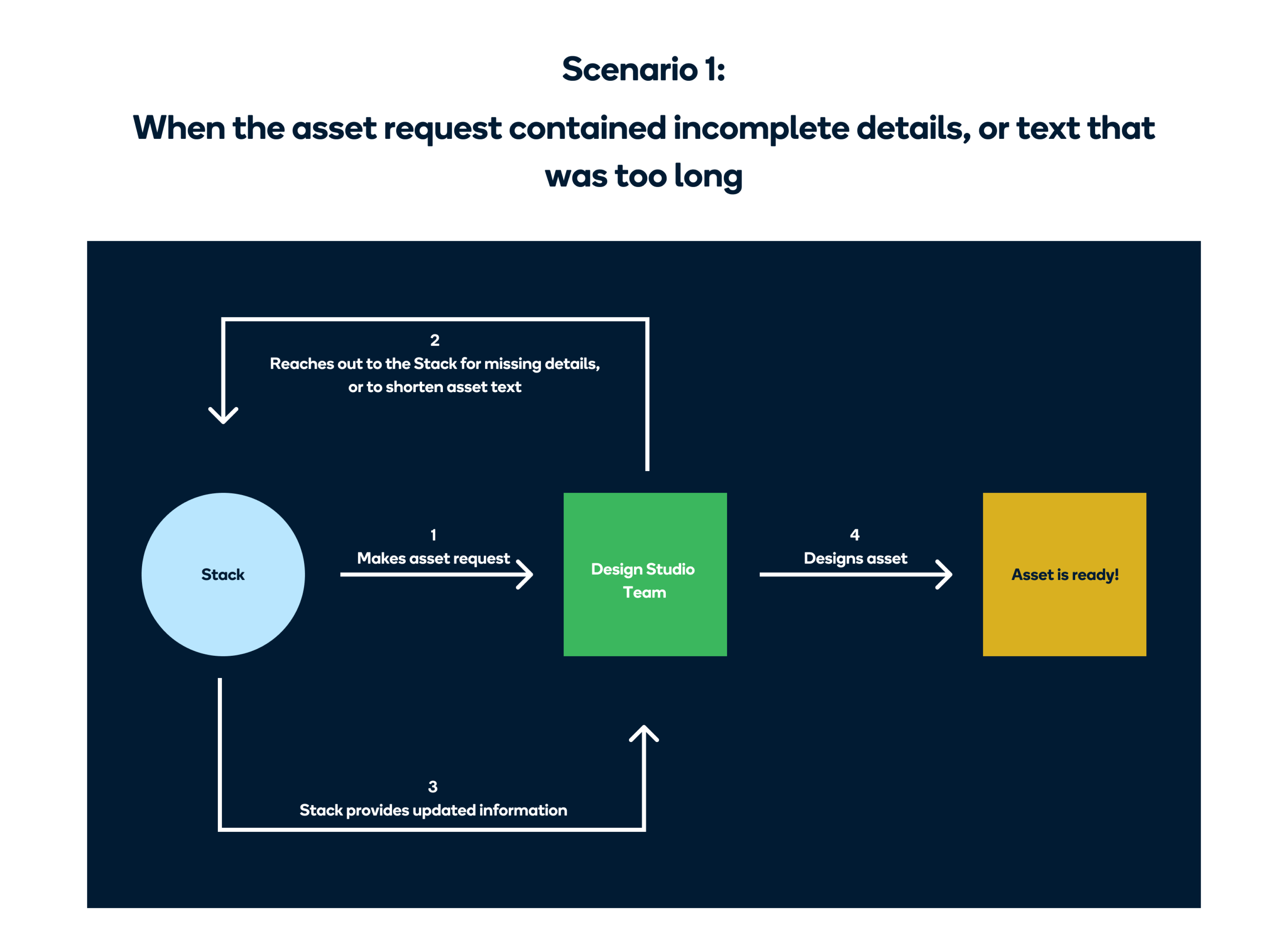
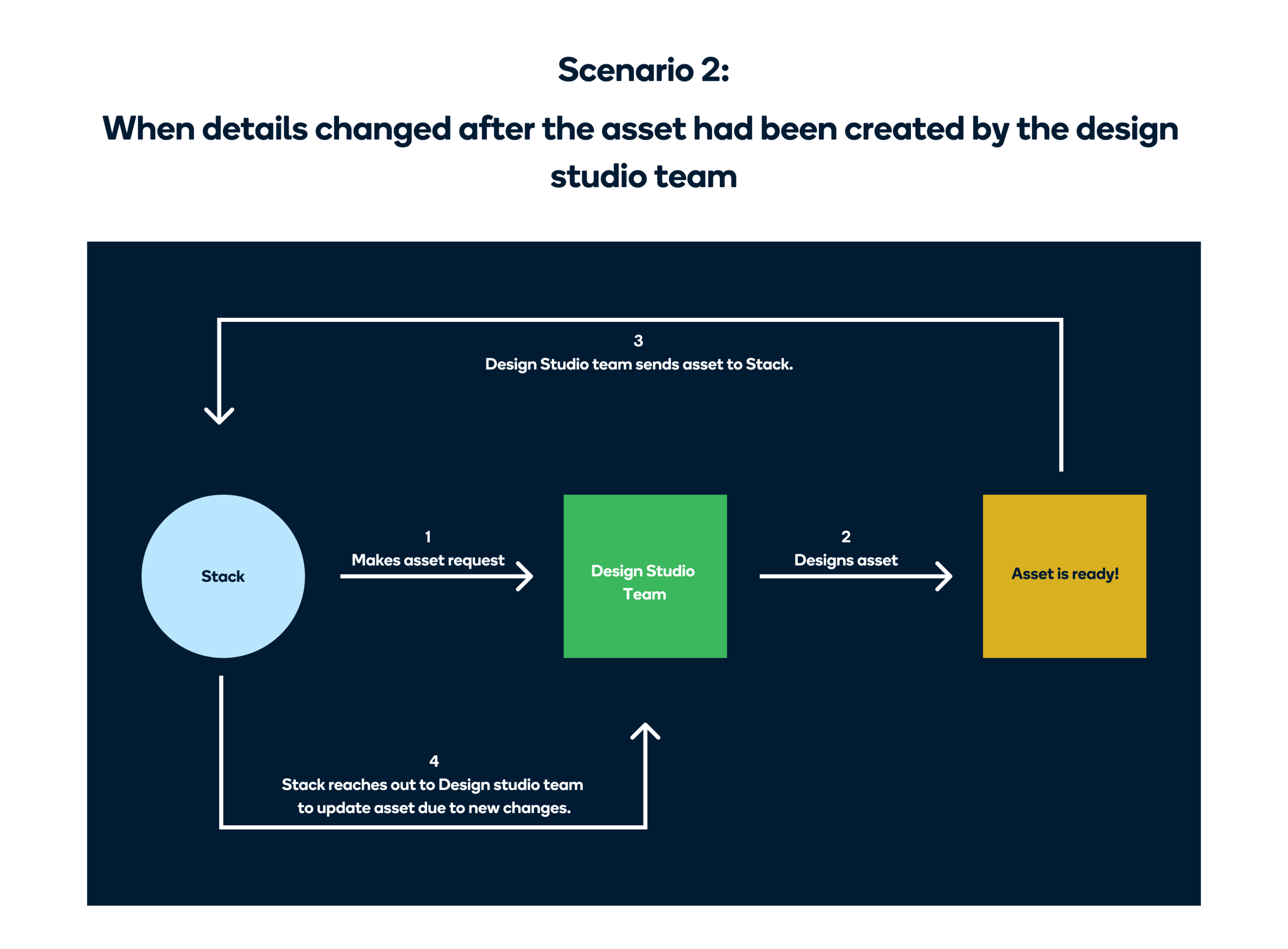
Our next step was to speak with our identified target users to validate our assumptions and fill in knowledge gaps. Based on these interviews, we discovered that the asset request and design process looked like this 👇🏽
Secondary Research
In addition to the interviews, we also did some secondary research into some sites like Canva, Pixelied, and Stencil, which were providing similar services.
BRAINSTORMING
Our first idea was to create two separate portals — one for Stacks (non-designers within Paystack) and another for the design studio team. However, we soon realized that managing two separate systems would add unnecessary complexity.
There was one major thing to consider;
"How can we make sure that all the assets produced by Stacks look consistent (in terms of spacing and layout), and match the Paystack brand?”
We figured out a solution for this. Instead of letting the Stacks directly edit the template, we thought about showing them a preview of the template, and providing them with a form that they could fill to edit that template. The form provided would depend on the template they wanted to edit, and the text fields would have character limits to ensure that any content added to the template did not mess up the layout.
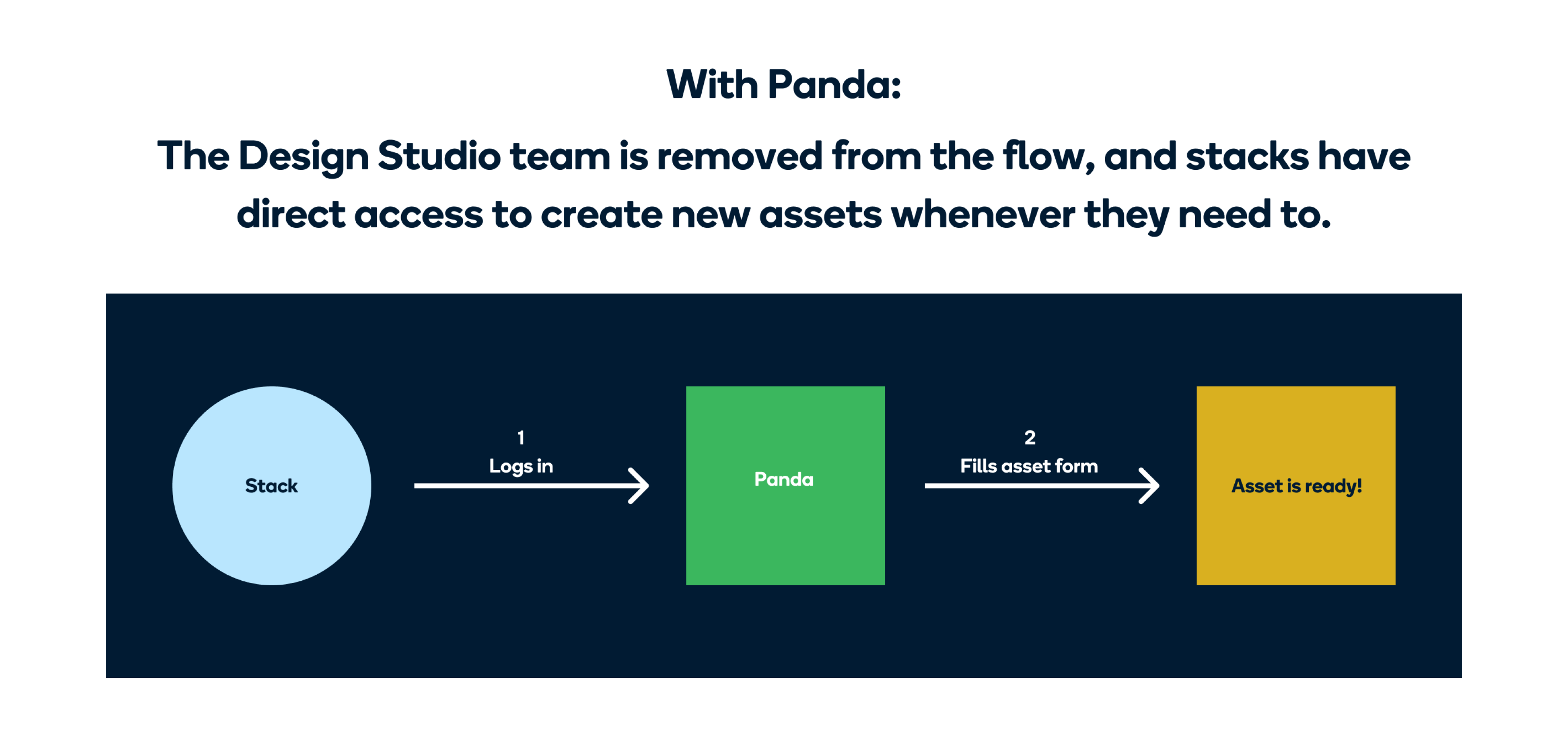
With Panda, we were trying to achieve this new workflow;
User flow
The first step in the design process was to define the user flow for desktop and mobile.
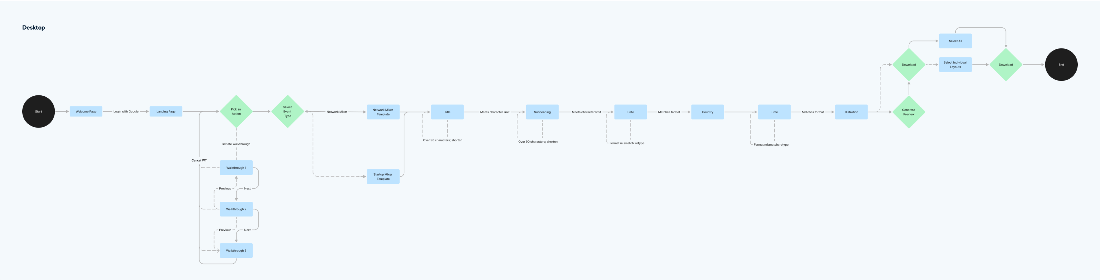
User flow for desktop
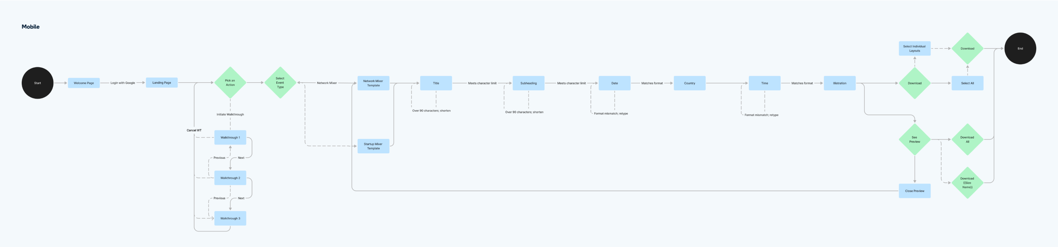
User flow for mobile
Low fidelity wireframes
We also worked on the low fidelity wireframes to determine what the basic structure would be. We decided to have a single page design with 3 distinct sections.
- The first section is the Build section with the form for Stacks to fill. These forms are dynamic, and are generated based on the asset the Stack wants to generate.
- The second section is the Preview section. After Stacks have filled a form, they can click on a button and see a preview of their flyer in the top right section.
- In the last section, Stacks can see what their flyer would look like across different touch points. (The touch points also differ based on the assets)
Low fidelity wireframes of desktop flow
FINAL OUTCOMES
- Login
- Select asset type
- Fill dynamic form
- Generate Preview
- Download
- Walkthrough
- Loom Video of the final product
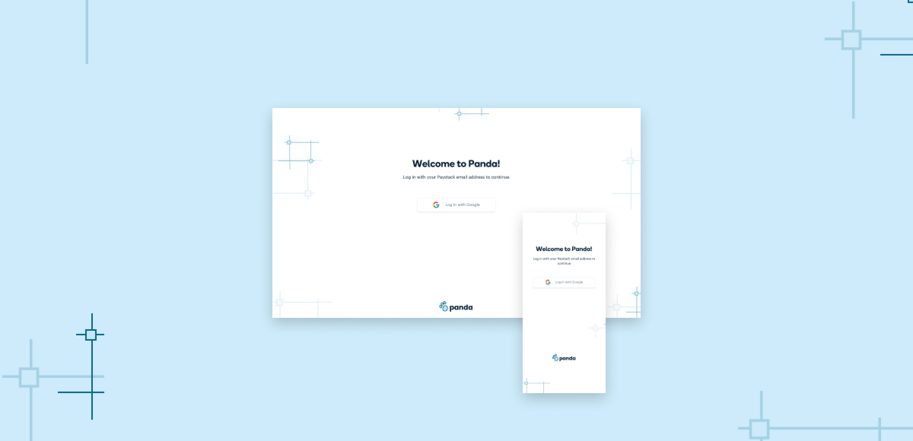
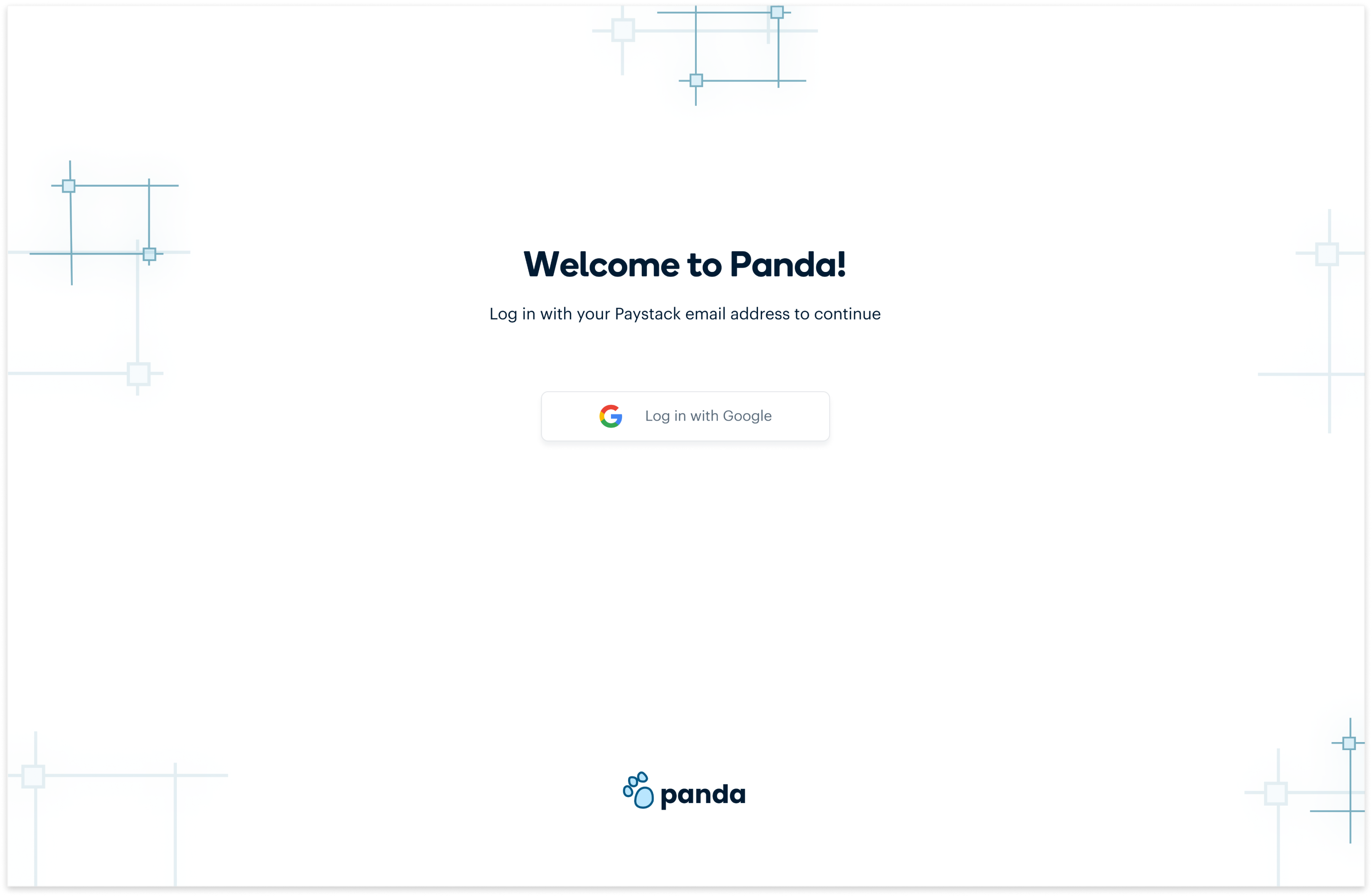
Before using Panda, Stacks have to log in with their Paystack email addresses.
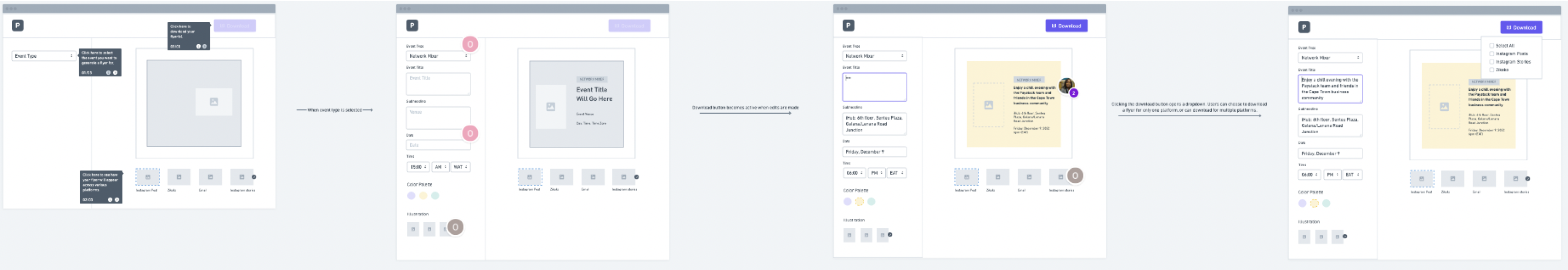
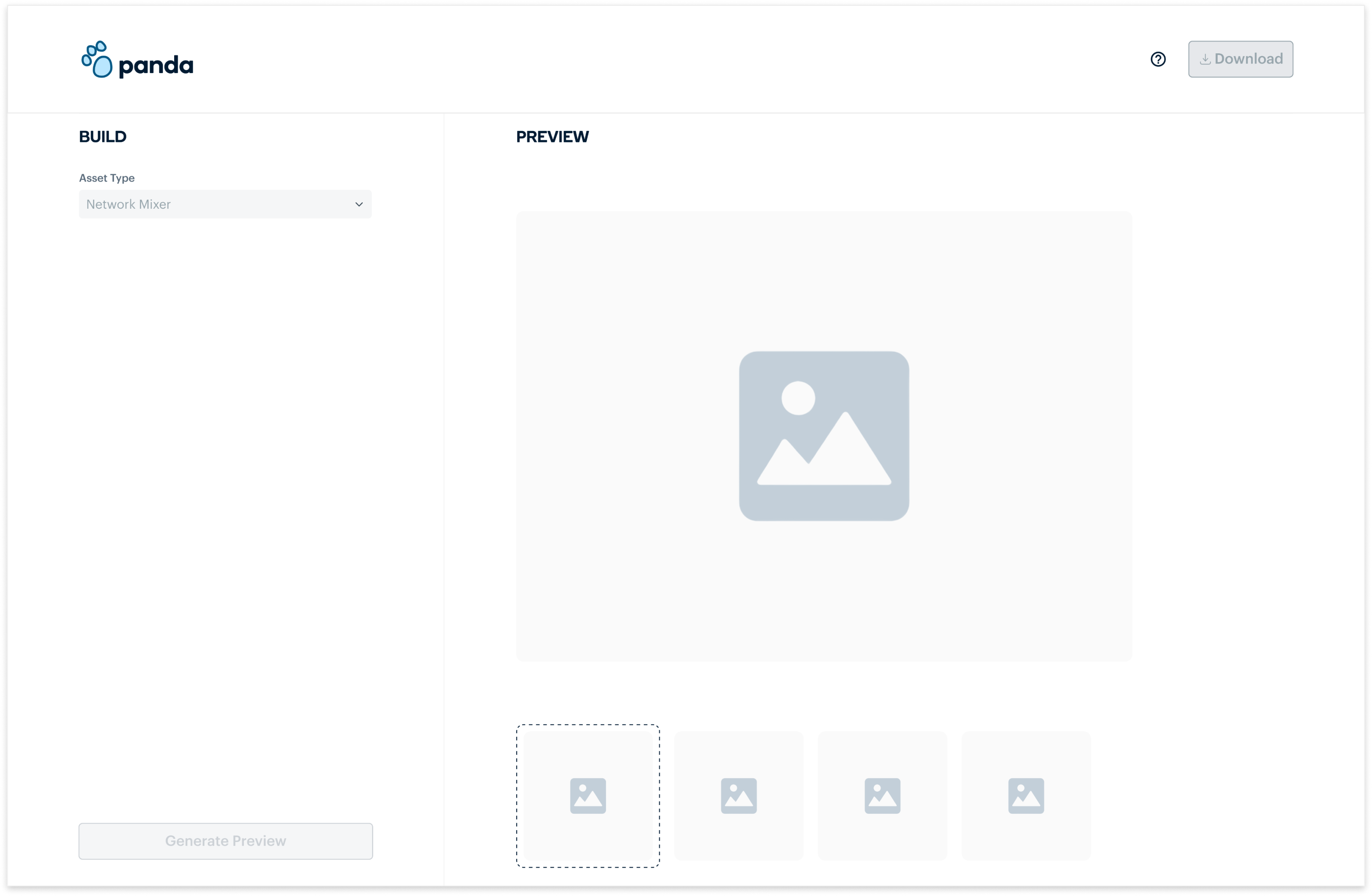
This is the Panda empty state, that shows when no event has been selected yet. To begin, a stack would choose an asset from the asset type dropdown
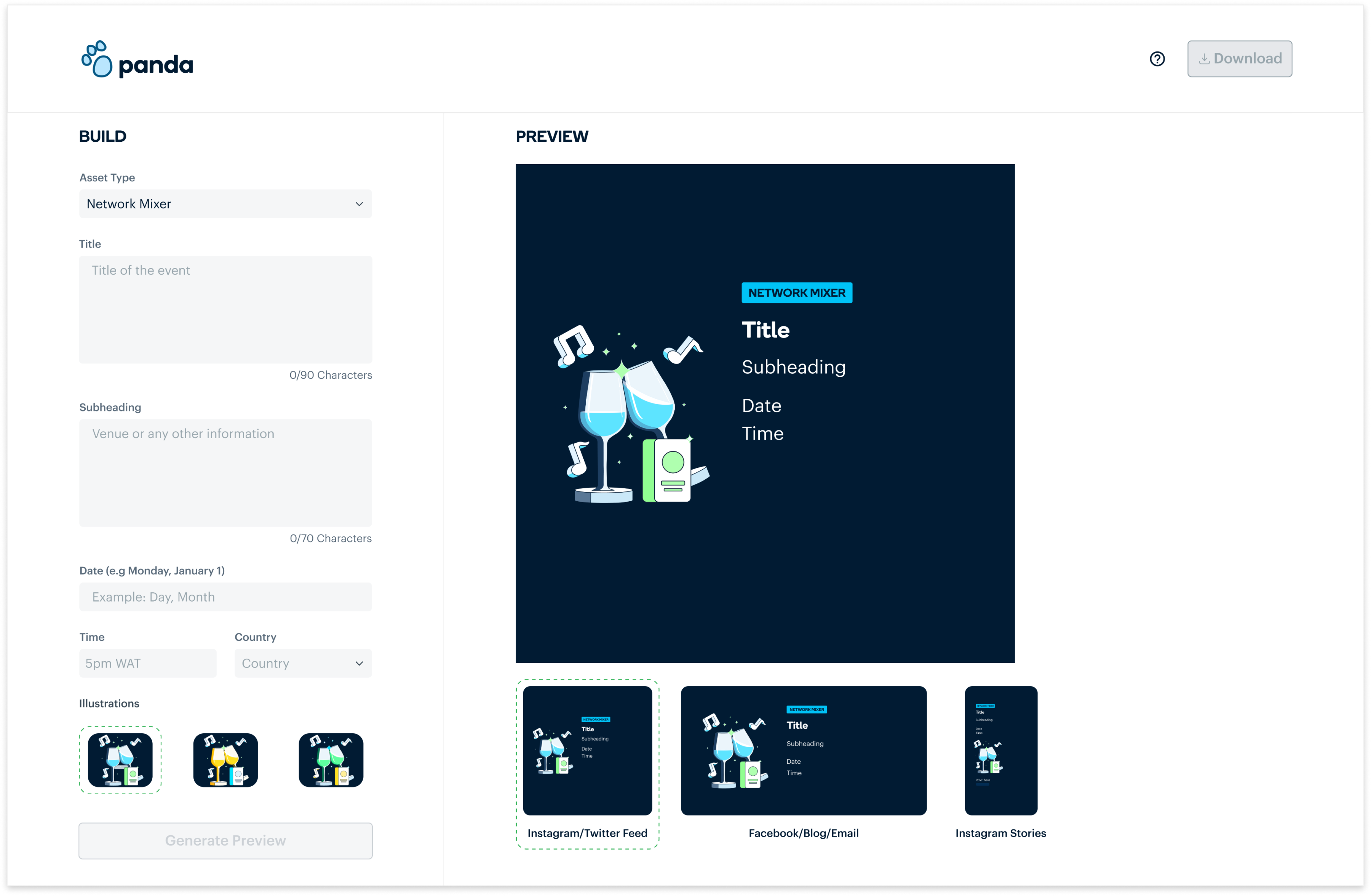
After choosing an asset type, a dynamic form is generated and Stacks can fill the input fields with the information they want on their asset. They can also choose from the illustrations provided.
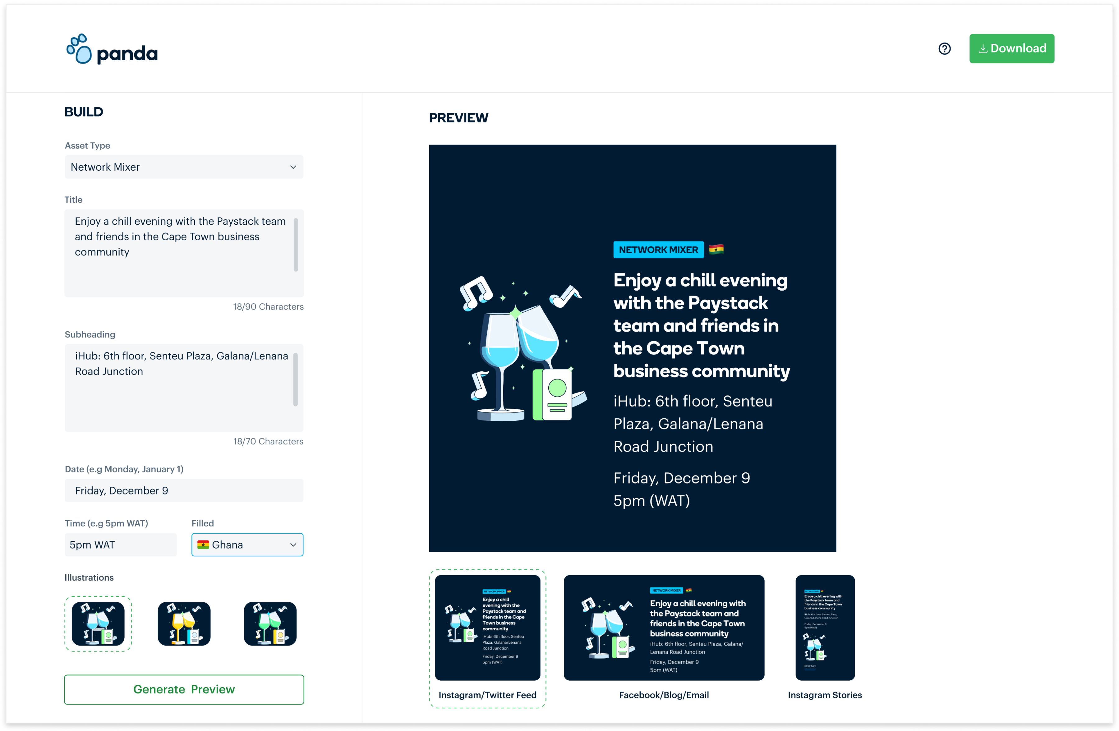
After filling the form, Stacks can click on the Generate preview button to see how their asset will look across different platforms.
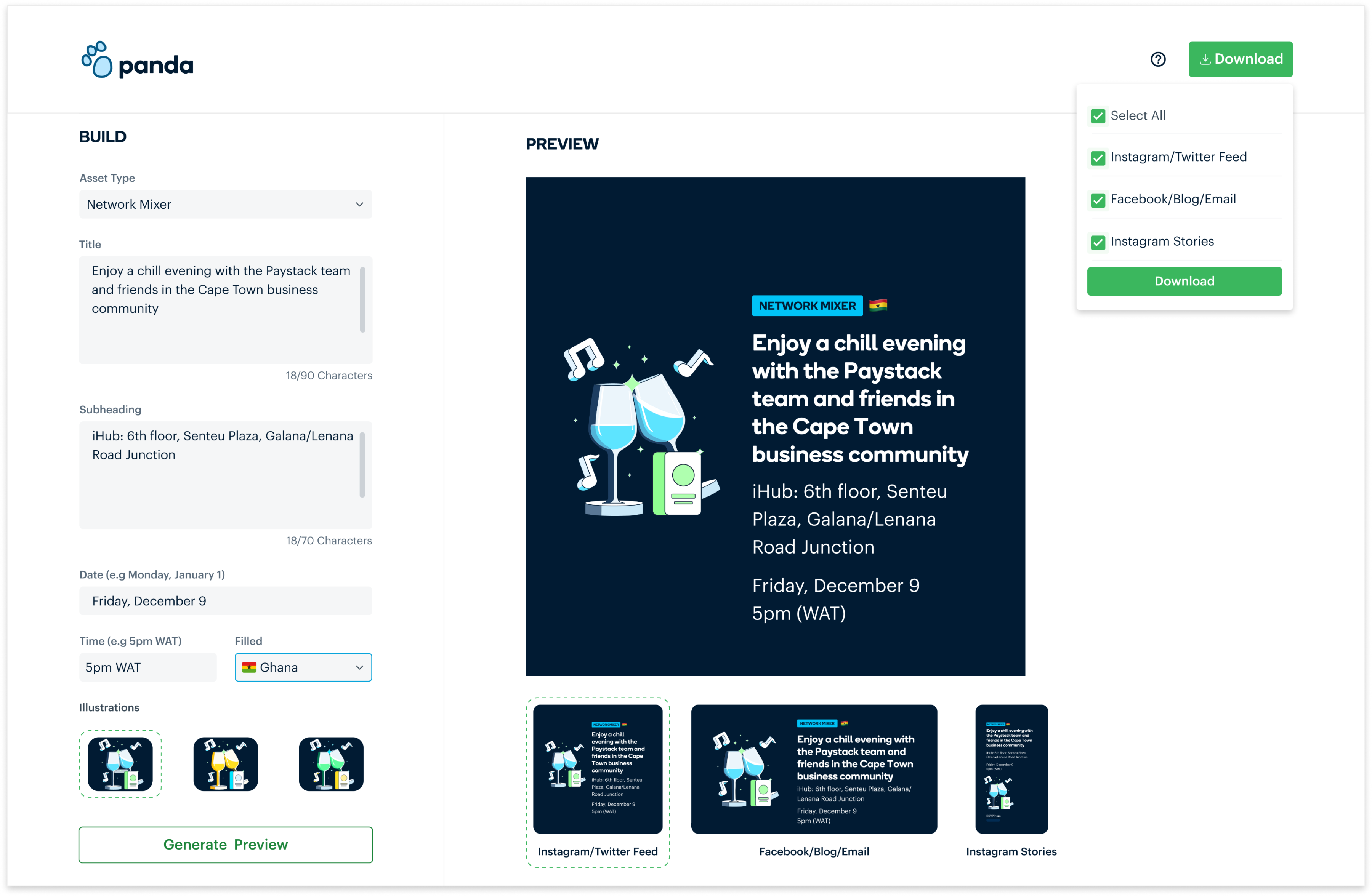
Stacks can then download the assets for all platforms or can download for specific platforms.
We provided a simple walkthrough for Stacks, to serve as a guide if it was ever needed. This step is triggered by clicking on the help icon at any point during the process.
IMPACT
- Improved Efficiency: The design studio team no longer spends time on repetitive tasks, which allows them to focus on more strategic, high-value work.
- Faster Turnaround: Teams can now generate assets in minutes, reducing the turnaround time from over a day to just 5 minutes
- Brand Consistency: Panda ensures all assets generated by different teams adhere to Paystack’s branding guidelines.
CHECK OUT MY NEXT PROJECT
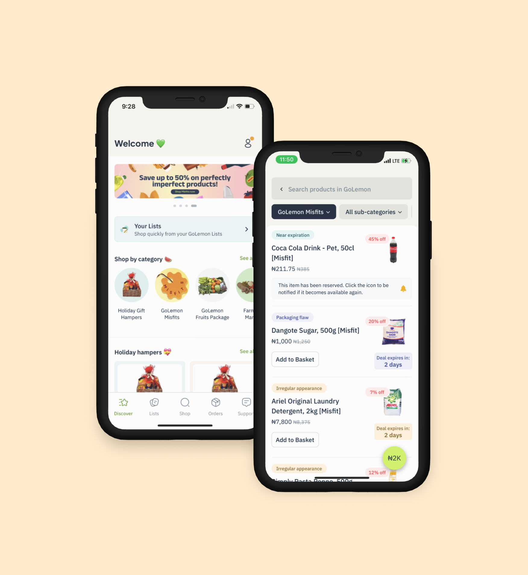
GoLemon Misfits
Reducing food waste and business loss
Design. Strategy.
Content guide