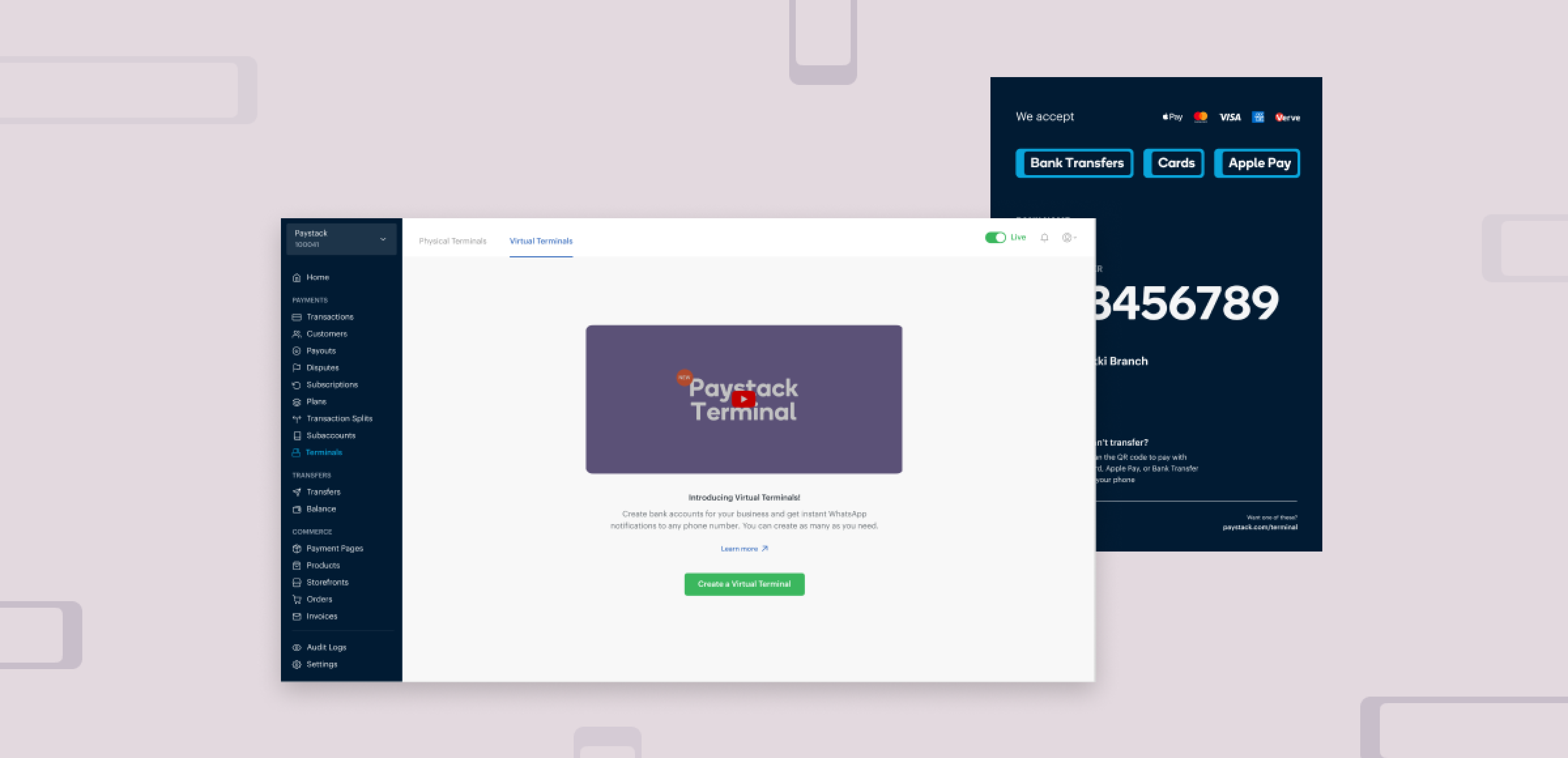
Paystack is a payment processing company based in Lagos, Nigeria. In 2023, Paystack launched Virtual Terminal, a payment channel that allows merchants to accept in-person payments without physical POS devices. This solution was developed to address key pain points faced by merchants: high costs of physical terminals, limited support for international cards, and inefficiencies in handling bank transfers. Virtual Terminal offered a low-cost, efficient alternative to physical POS devices, improving payment processing for businesses of all sizes.
TIMELINE
The project spanned 3–4 months from concept to launch, involving multiple iterations, user research phases, and usability testing cycles to refine the design.
ROLE
As the Product Designer, I worked closely with the design team lead, engineers, and the marketing team. My responsibilities included leading the design of the payment page, and dashboard flows. I also played an active role in usability testing, gathering merchant feedback, and iterating on designs to ensure the solution met merchant needs.
IMPACT
- Within six months, Virtual Terminal matched and exceeded the payment volume of physical POS devices. It currently processes $2,000,000+ in monthly transactions which demonstrates its effectiveness as a scalable alternative to physical devices.
- Merchants gained the ability to accept international payments seamlessly, opening new revenue streams.
- Real-time WhatsApp notifications empowered merchants to respond quickly to transactions, reducing customer wait times and improving service delivery.
- Clear communication and intuitive design led to higher merchant adoption and satisfaction rates.
THE PROBLEM
In 2022, Paystack launched Terminal, a physical POS device to enable merchants collect in-person payments from their customers. The launch of these devices uncovered some problems that led to a rethink of how to improve the in-person payment experience. The main problems were:
1. High Costs:
Small businesses struggled with the initial cost of physical terminals, and larger businesses found it expensive to scale across multiple payment points.
2. Limited Payment Options:
The devices did not support international cards, causing friction for merchants who served foreign customers.
3. Bank Transfer Delays:
Small businesses relying on bank transfers to collect payments (because they could not afford physical terminals) experienced significant delays in transaction notifications, leading to long customer wait times and confusion.
OBJECTIVE
To create an affordable, accessible solution for merchants to accept in-person payments, while improving transaction efficiency, enabling international payments, and reducing customer wait times.
GOALS
- Provide a payment solution with minimal upfront costs, accessible to both small and large businesses.
- Support a broad range of payment options, including international cards and Apple Pay.
- Speed up transaction notifications to reduce waiting time for customers.
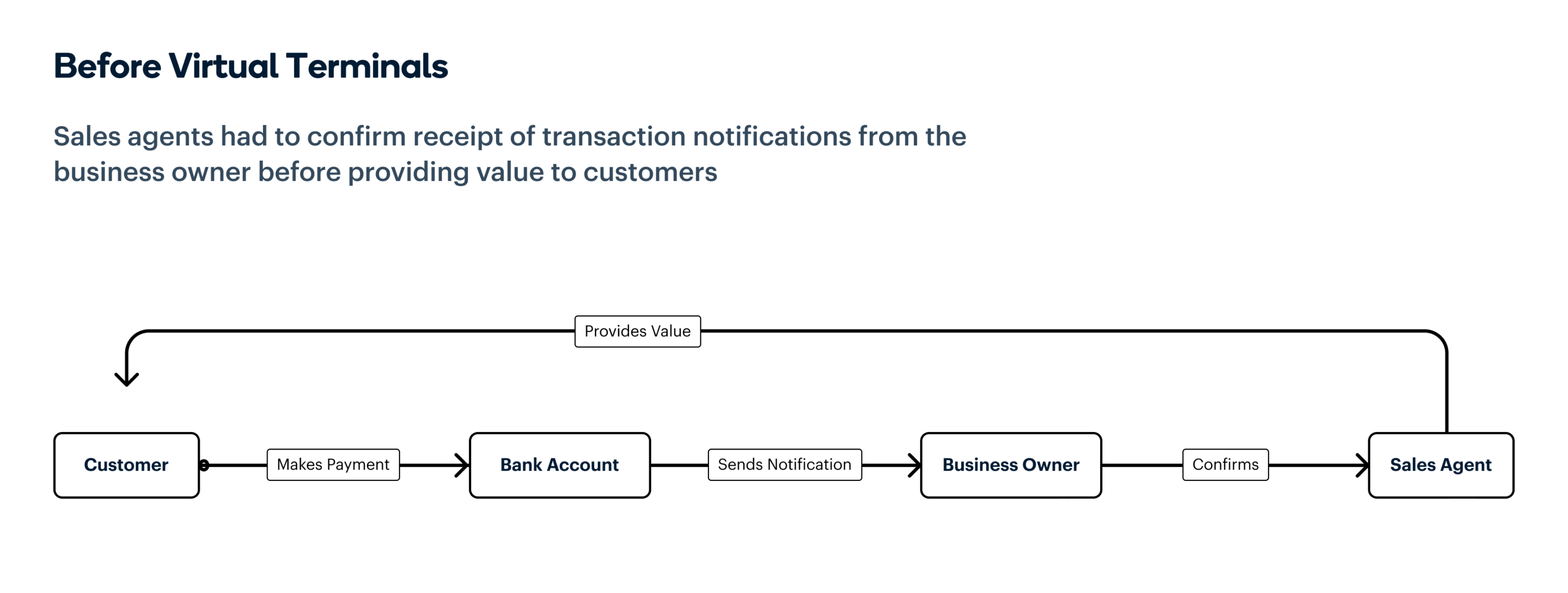
In-person payment flow before Virtual Terminal launch
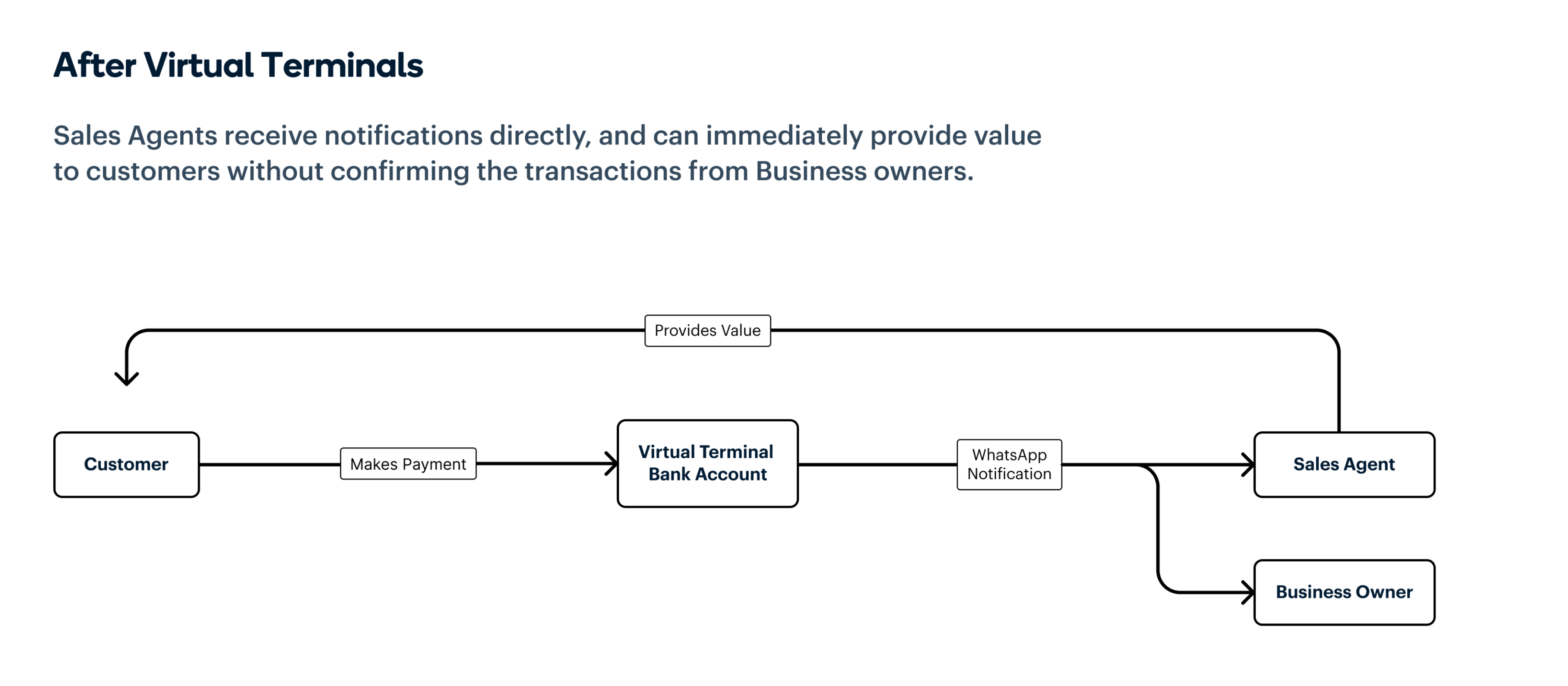
In-person payment flow after Virtual Terminal launch
RESEARCH & BRAINSTORMING
Working closely with the product team and other stakeholders, we defined how the Virtual Terminal would function and identified the pain points to address. Through customer conversations and pilot testing, we identified three key components to build:
- A Payment Page supporting international cards and Apple Pay.
- A Poster showing a business’s dedicated virtual account. In partnership with a local bank, these virtual accounts were set up to process transactions immediately and send instant WhatsApp transaction notifications.
- A Web Dashboard for merchants create virtual terminals, download their posters, and register WhatsApp numbers for notifications.
Designing the payment Page
1st iteration: I began with a mobile-first design to prioritise ease of use. The first design was a 2 step process, with users inputting their basic information in the first page and then choosing a payment option on the second page.
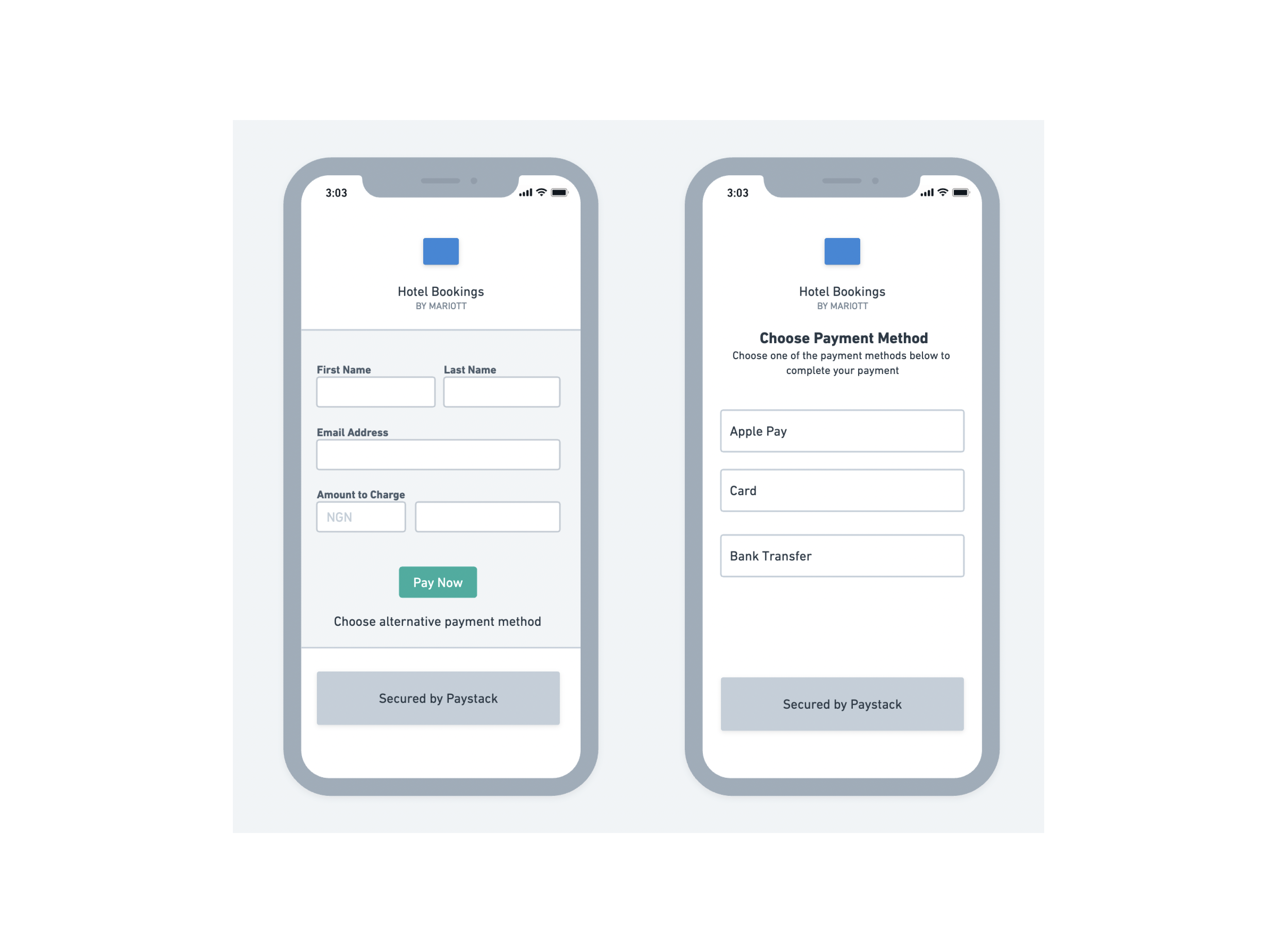
First iteration of the payment page with one page for capturing customer details
2nd iteration
During user testing, Merchants expressed the need for quick access to payment options, and the importance of showing the different card types that were accepted, so I simplified the flow to reduce friction. The new iteration had just one page collecting the amount to pay and the payment options, changing the flow from 2 steps to 1, and reducing the amount of time needed to make payment.
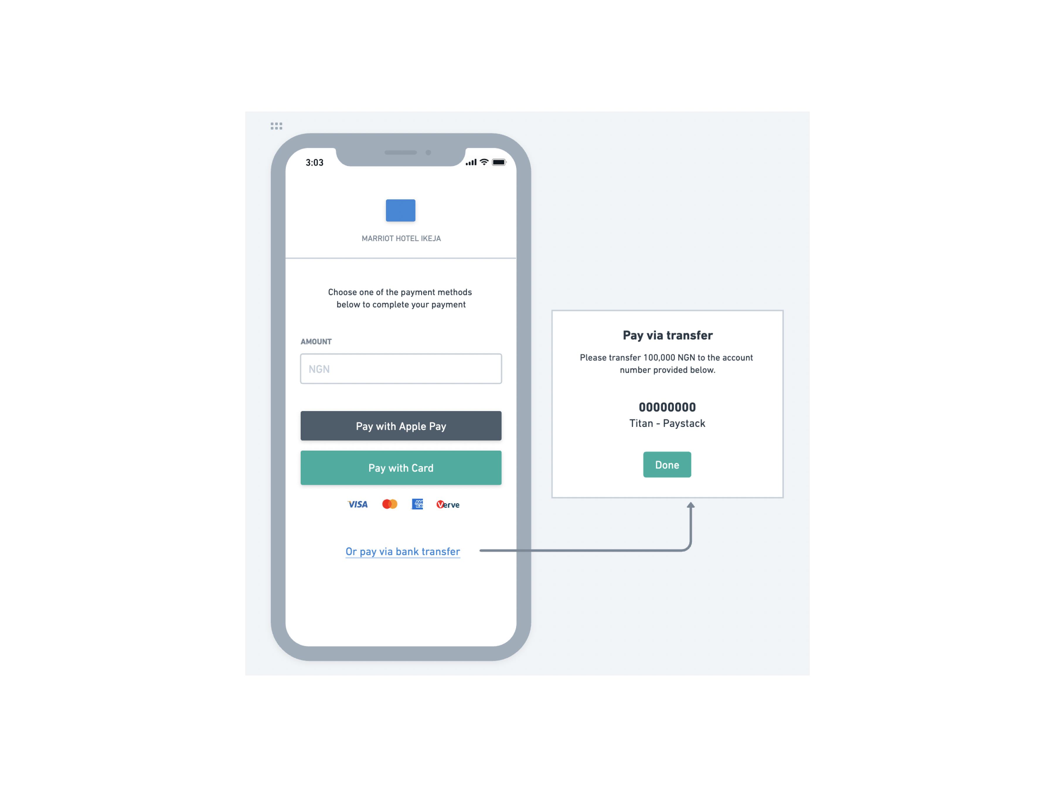
Low fidelity design of the second iteration of the payment page with one page for capturing customer details
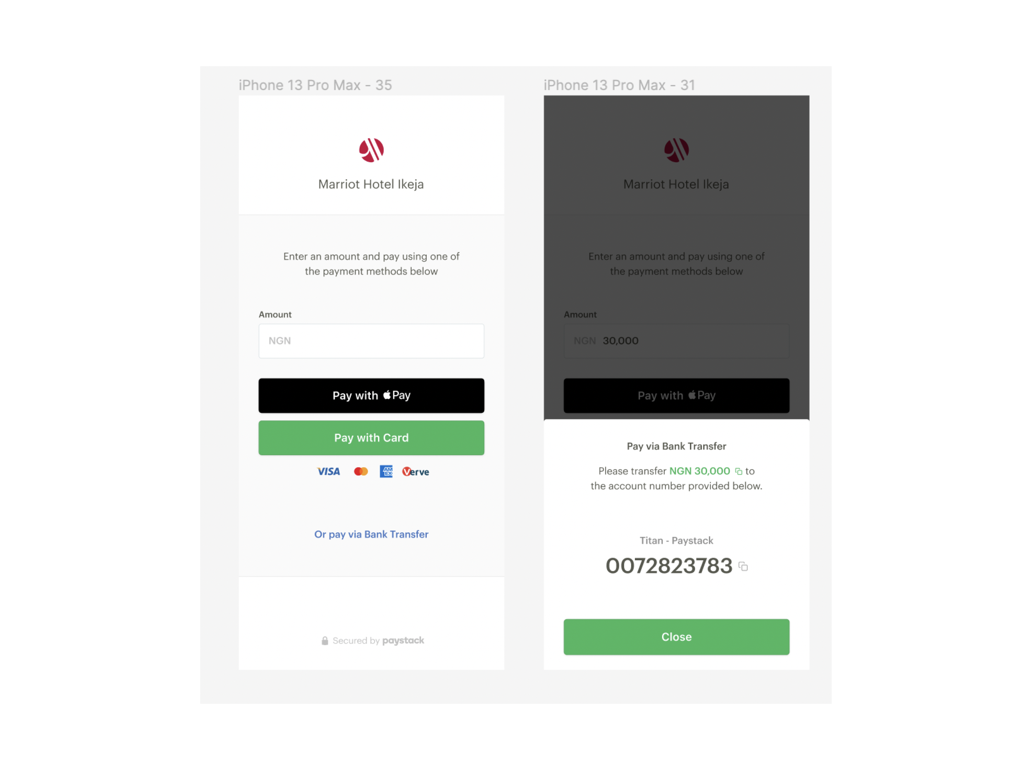
High fidelity design on the second iteration of the payment page with one page for capturing customer details
Designing the Poster
There were 4 main things we were employing the poster to do:
- Show the different payment channels that could be used.
- Show the different Card types that were accepted.
- Show the QR code that could be scanned to get to the payment page
- Show the account number for bank transfers.
1st iteration: Early designs emphasised the QR code as the main payment channel. The idea was that since scanning the code opened up the payment page that had most of the payment channels, it was the most important thing to show.
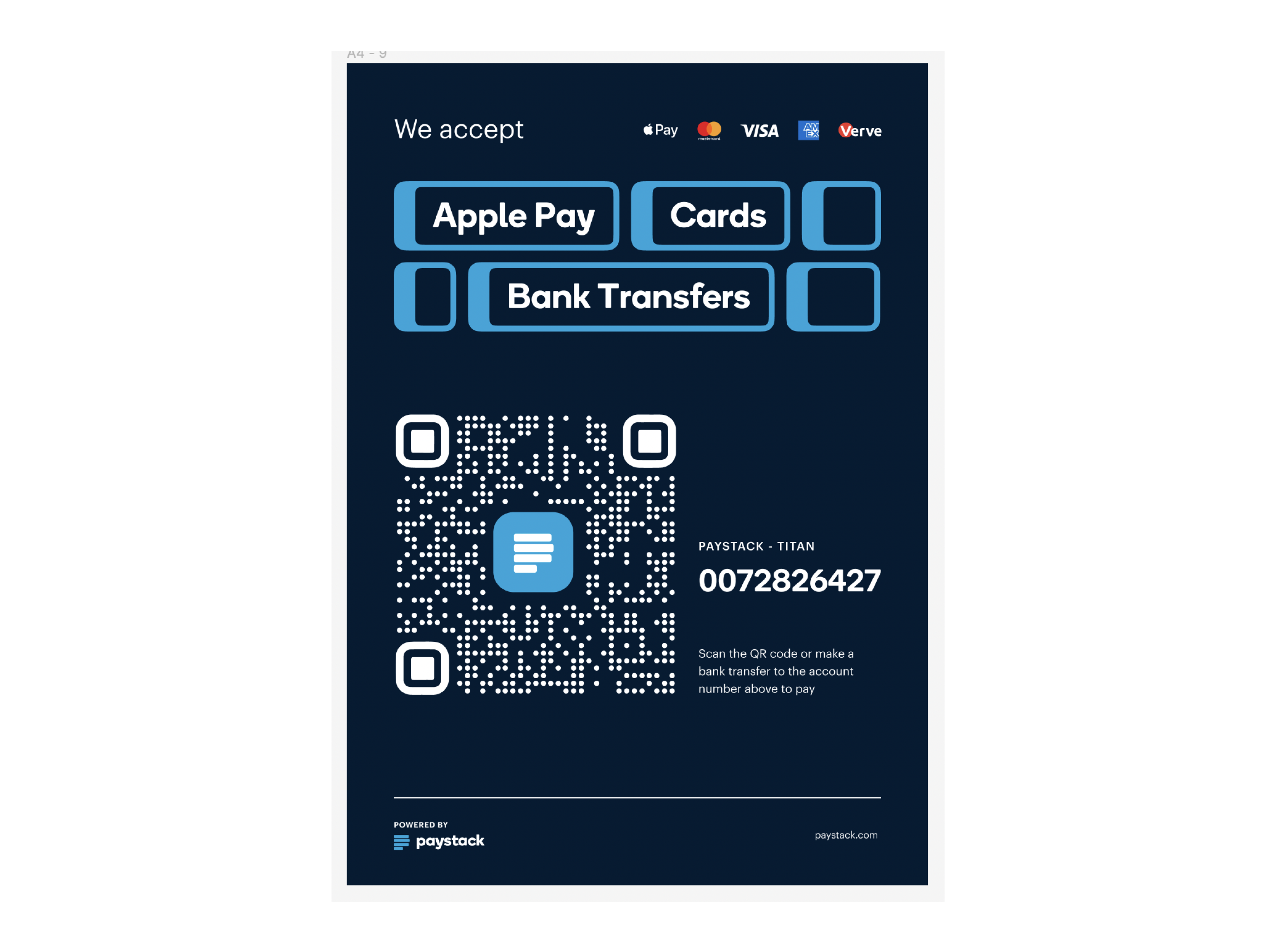
1st version of the Virtual Terminal Poster with the QR code emphasised as the main payment channel
2nd iteration
During user testing, merchants indicated that they would prefer the bank account number to be the most prominent, as that was the channel that most users used to make payments. Based on this, we shifted the focus of the posters to the bank accounts. In a subsequent iteration, we also added labels to the bank details to reduce user confusion we noticed during testing.
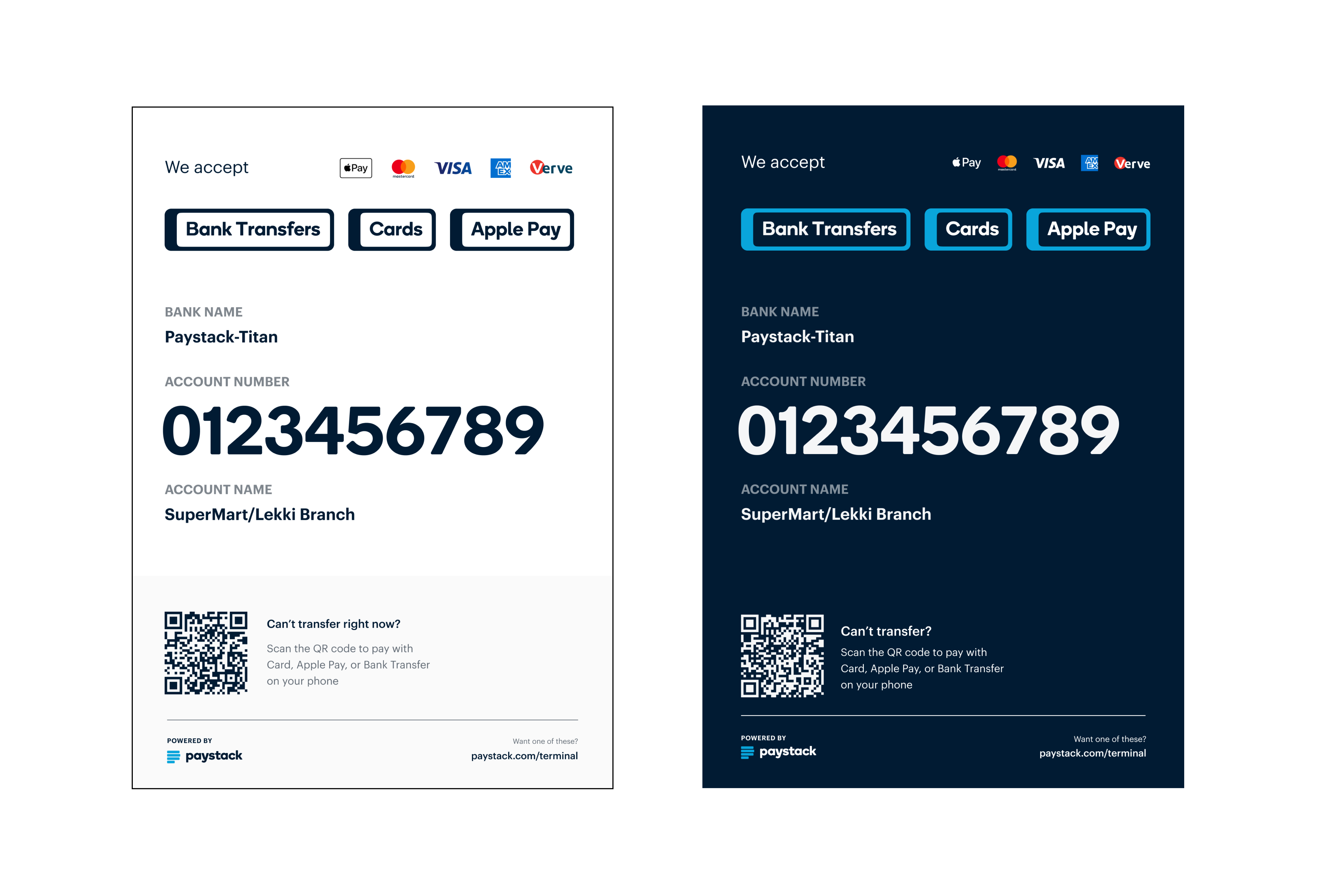
Final version of the Virtual Terminal Poster with bank transfers emphasised.
Designing Dashboard flows
1st iteration
The initial plan for the dashboard flow was to enable merchants to:
- Create a Virtual Terminal and add a WhatsApp number to receive transaction notifications. (At this point, the idea was to have just one WhatsApp number receive notifications for a Virtual Terminal).
- View a list of all the Virtual Terminals they had created
- View the details of a particular Virtual Terminal such as the list of all the transactions that had taken place on the terminal, and how much had been collected.
- Preview, customise and download the Poster we had prepared for them to show to their customers.
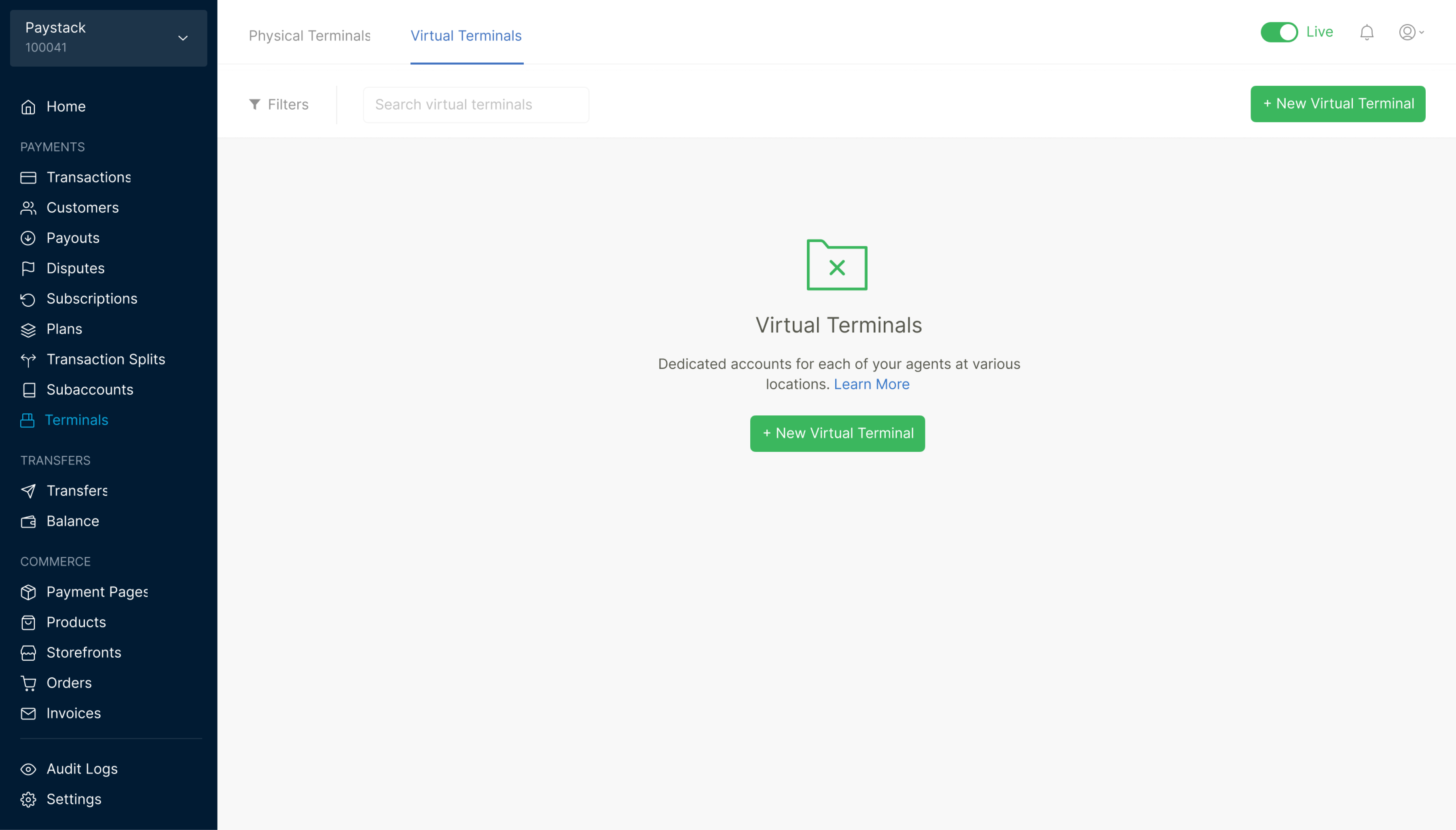
1st iteration of the empty state for the dashboard flow
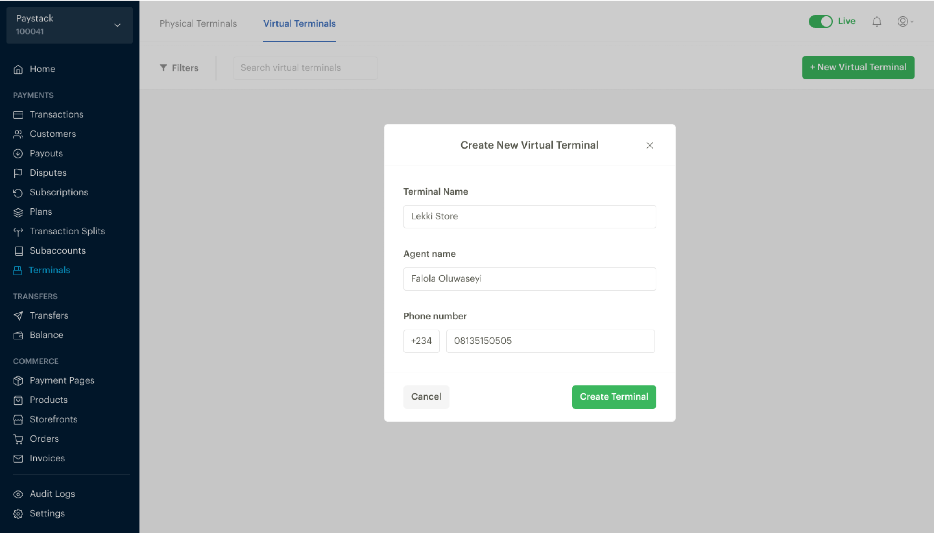
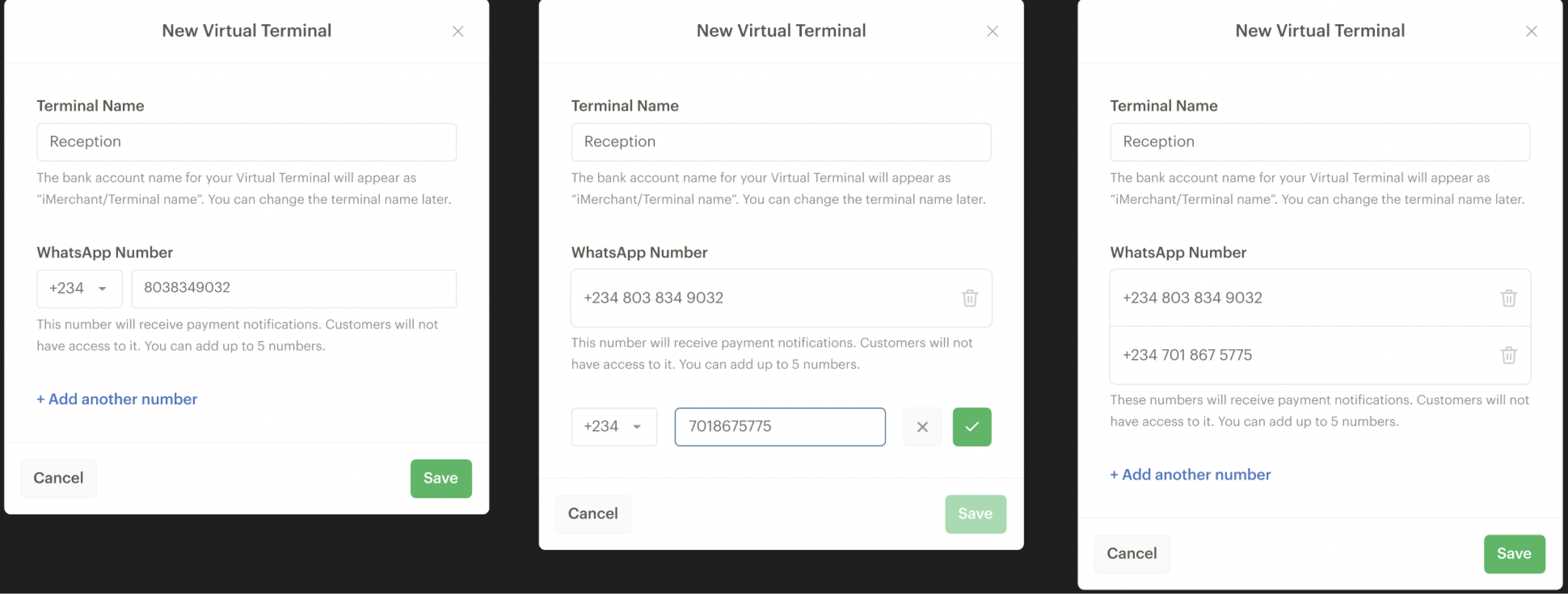
1st iteration of modal to create a new Virtual Terminal. In this iteration, only one WhatsApp number could be added to a Virtual Terminal
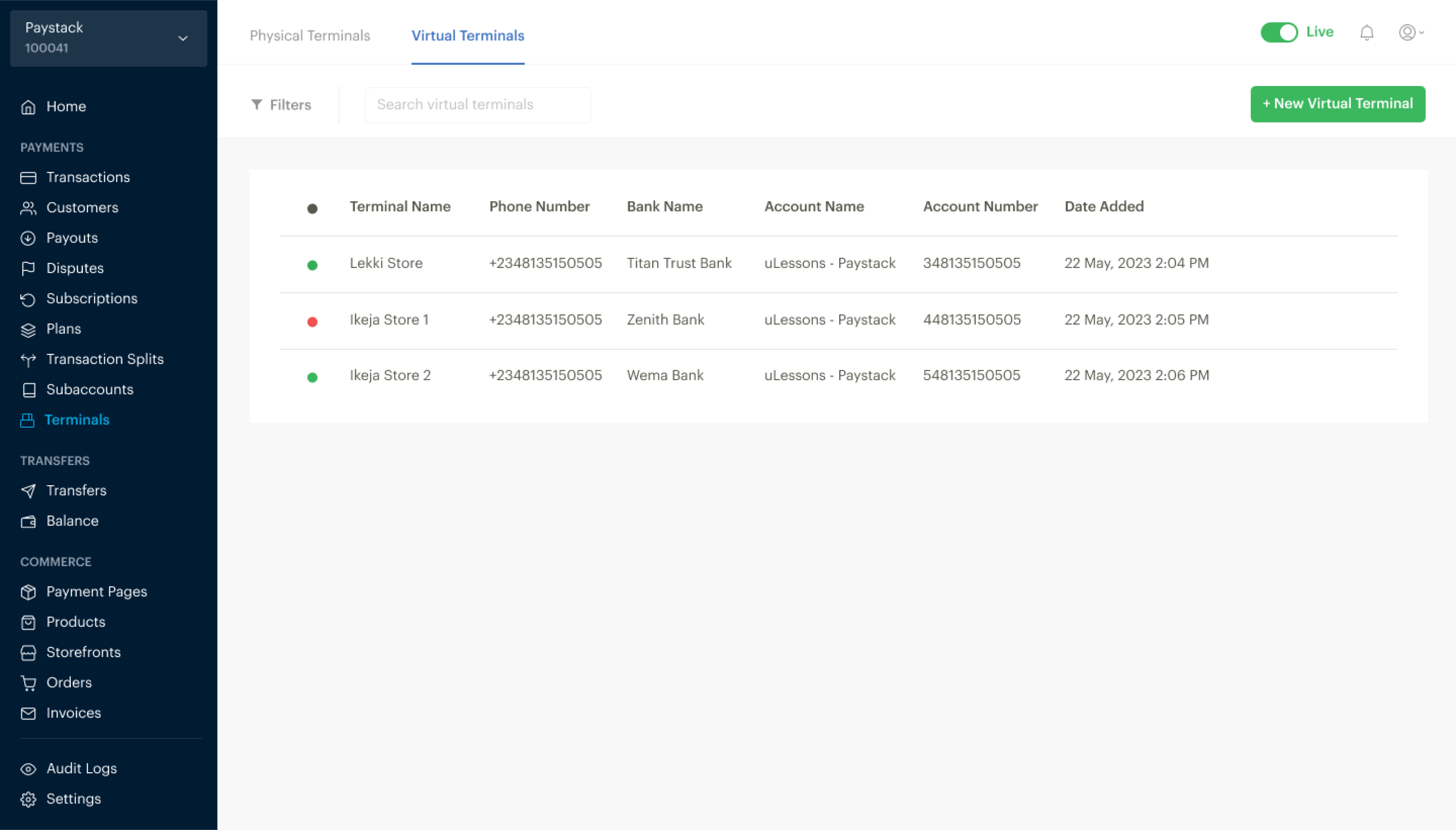
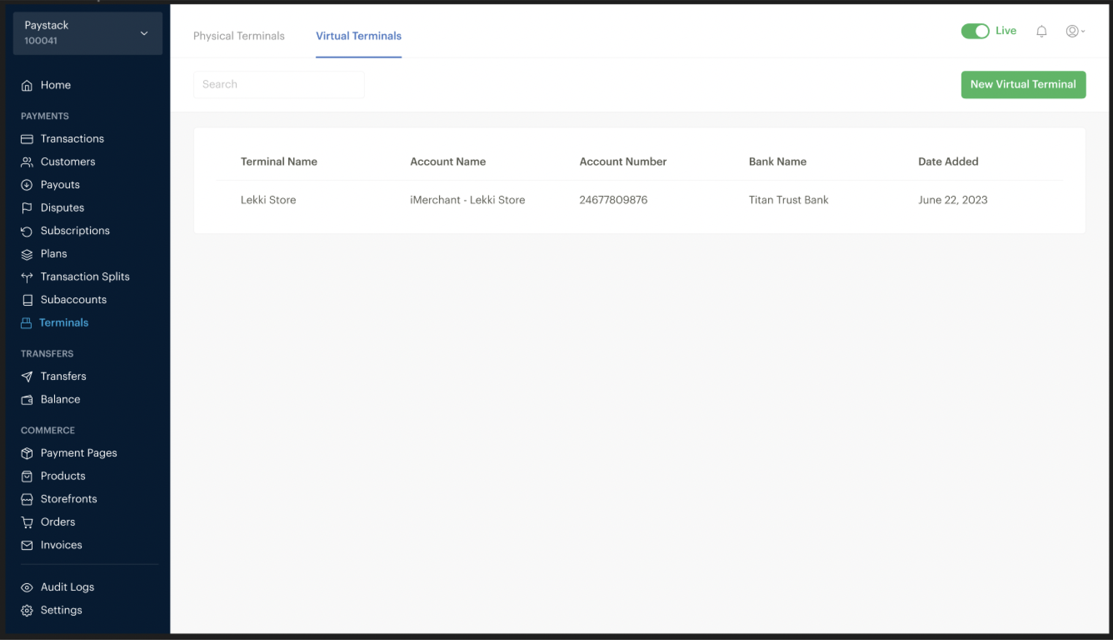
1st iteration of the Virtual Terminal list
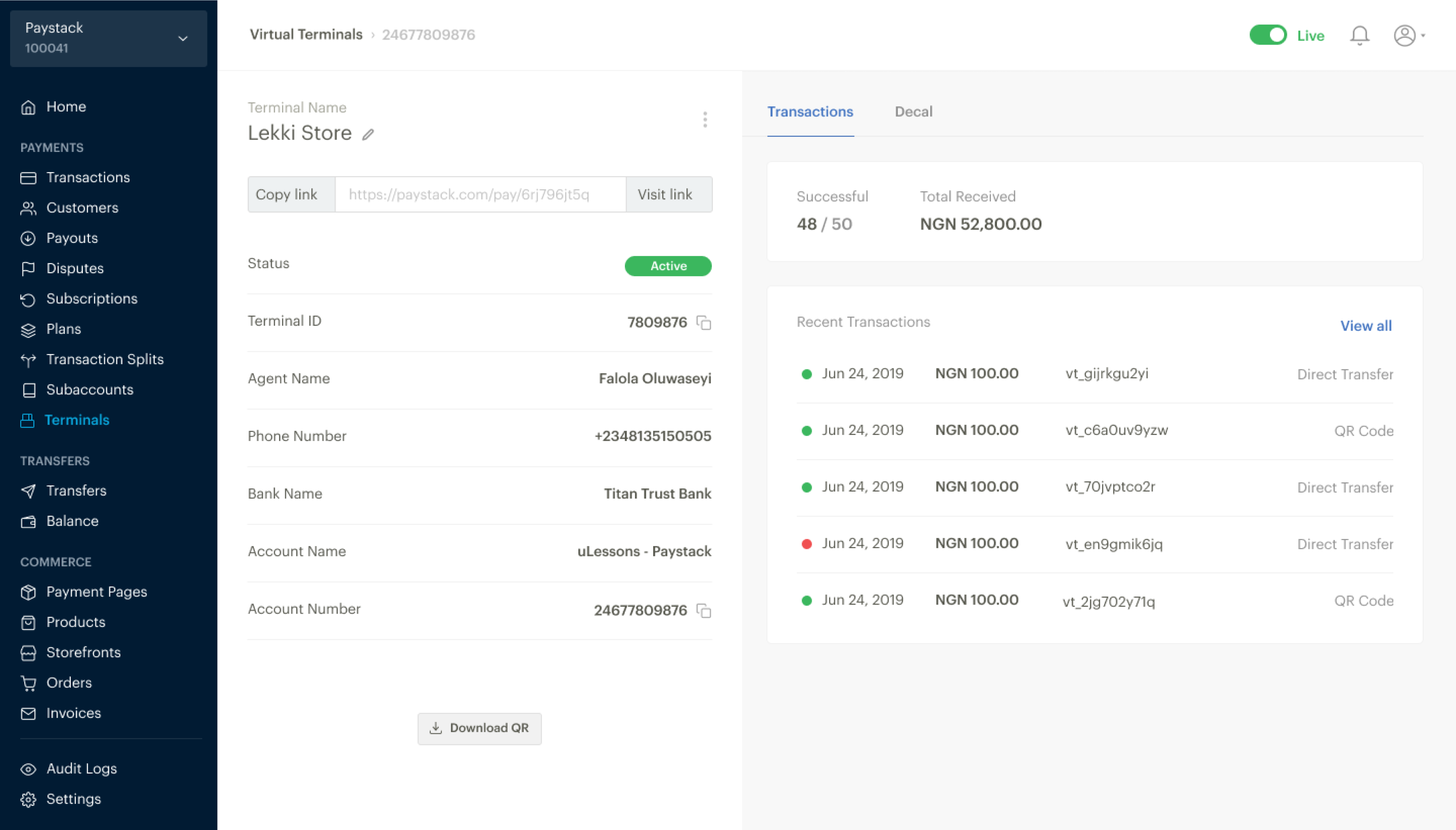
1st iteration of the Virtual Terminal details page
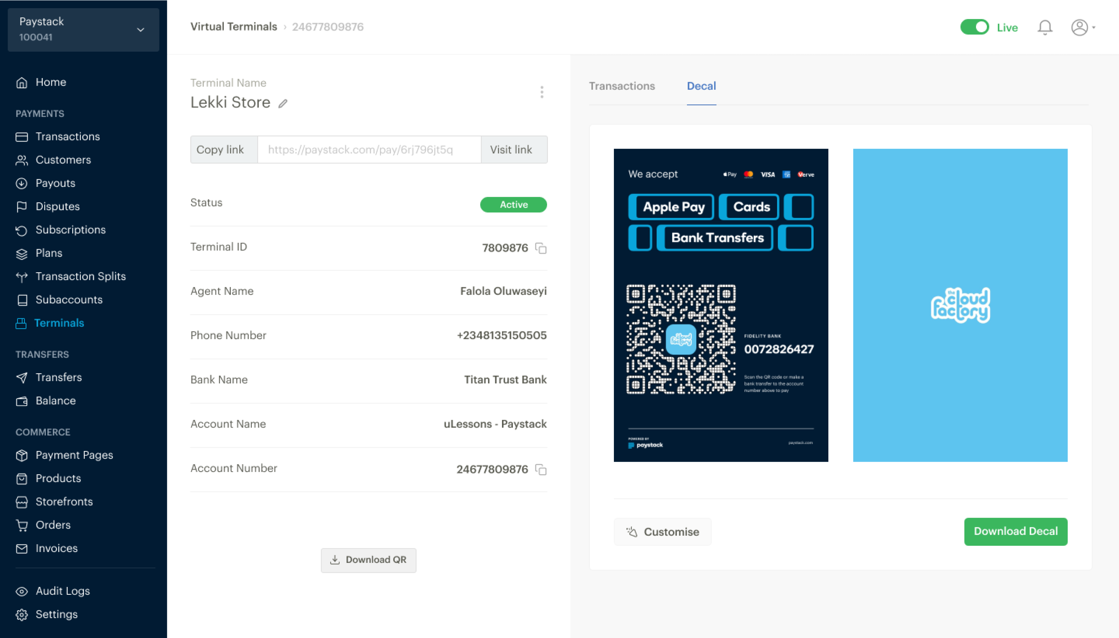
1st iteration with option to customize the Virtual Terminal
After user testing of the 1st iteration, we updated the designs to do the following based on user feedback:
- Allow up to five WhatsApp numbers per terminal, accommodating larger teams.
- Remove poster customisation, providing pre-designed templates for ease of use.
- Refine the copy for clearer instructions regarding account naming and terminal limits.
FINAL DASHBOARD OUTCOMES
Final UI designs of the dashboard flow.
- Empty State
- Modal flow for creating a Virtual Terminal
- Virtual Terminal list
- Virtual Terminal detail page
- Virtual Terminal Poster page
- Transactions page
- Notifications page
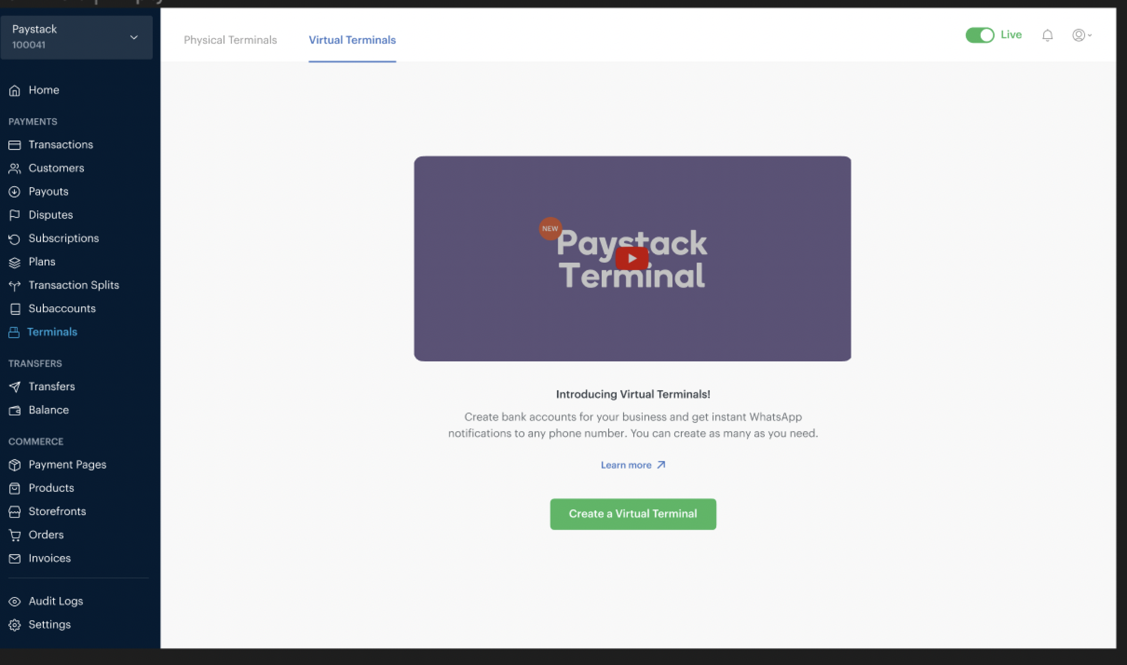
Virtual Terminal empty state, with a video introducing Virtual Terminals and a button to create a Virtual Terminal.
We thought about hiding the helper text in info icons to achieve a cleaner UI, but this was important information that we did not want any merchant to miss so we had to trade-off.
Merchants can see a list of all the Virtual Terminals they have created.
Details of the Virtual Terminal and the 2 options for the Virtual Terminal Posters.
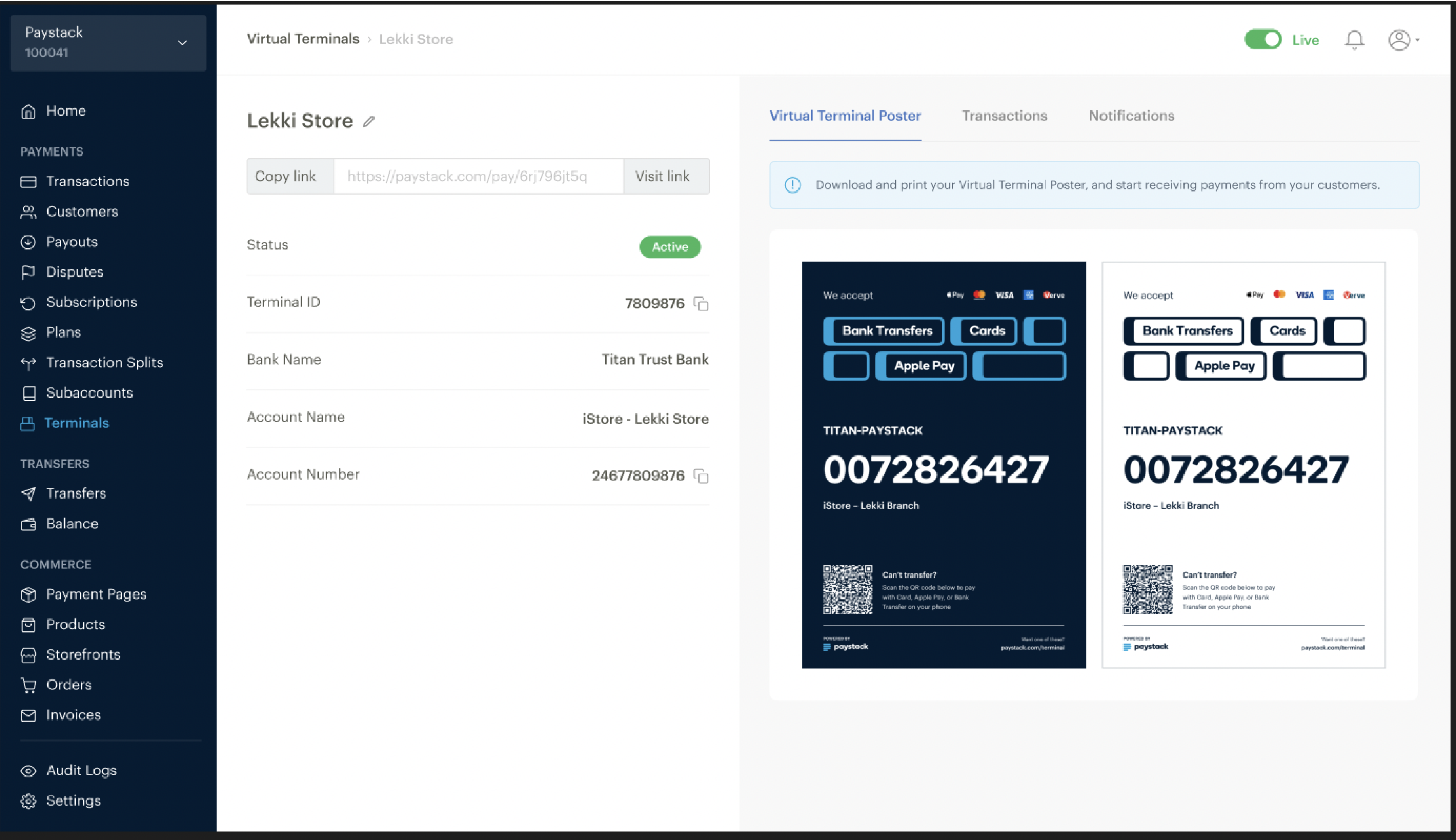
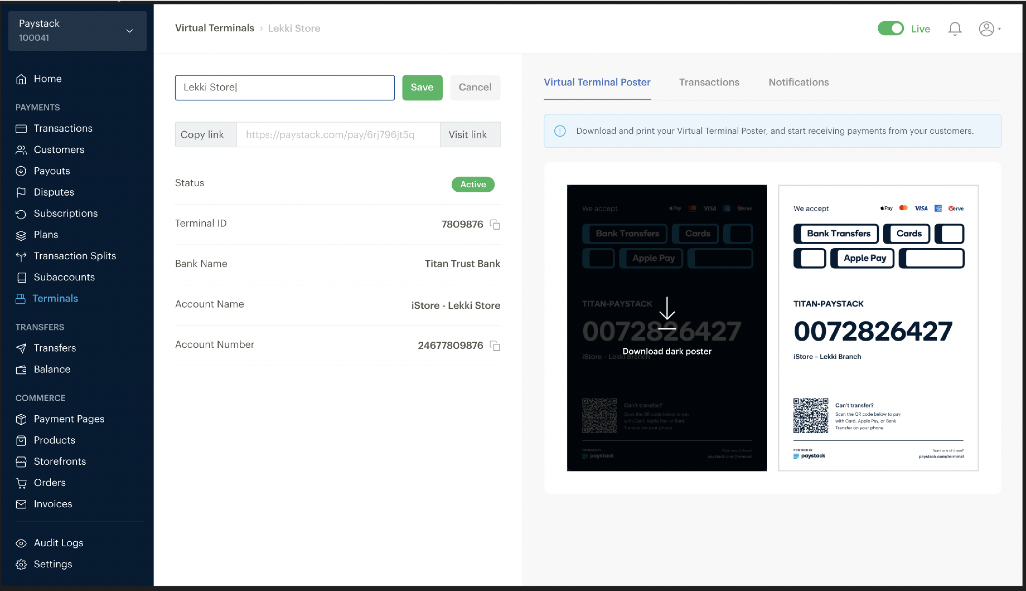
The name of the Virtual Terminal can be edited as shown on the left side. Clicking on any of the Poster options will download the Poster (as shown on the right).
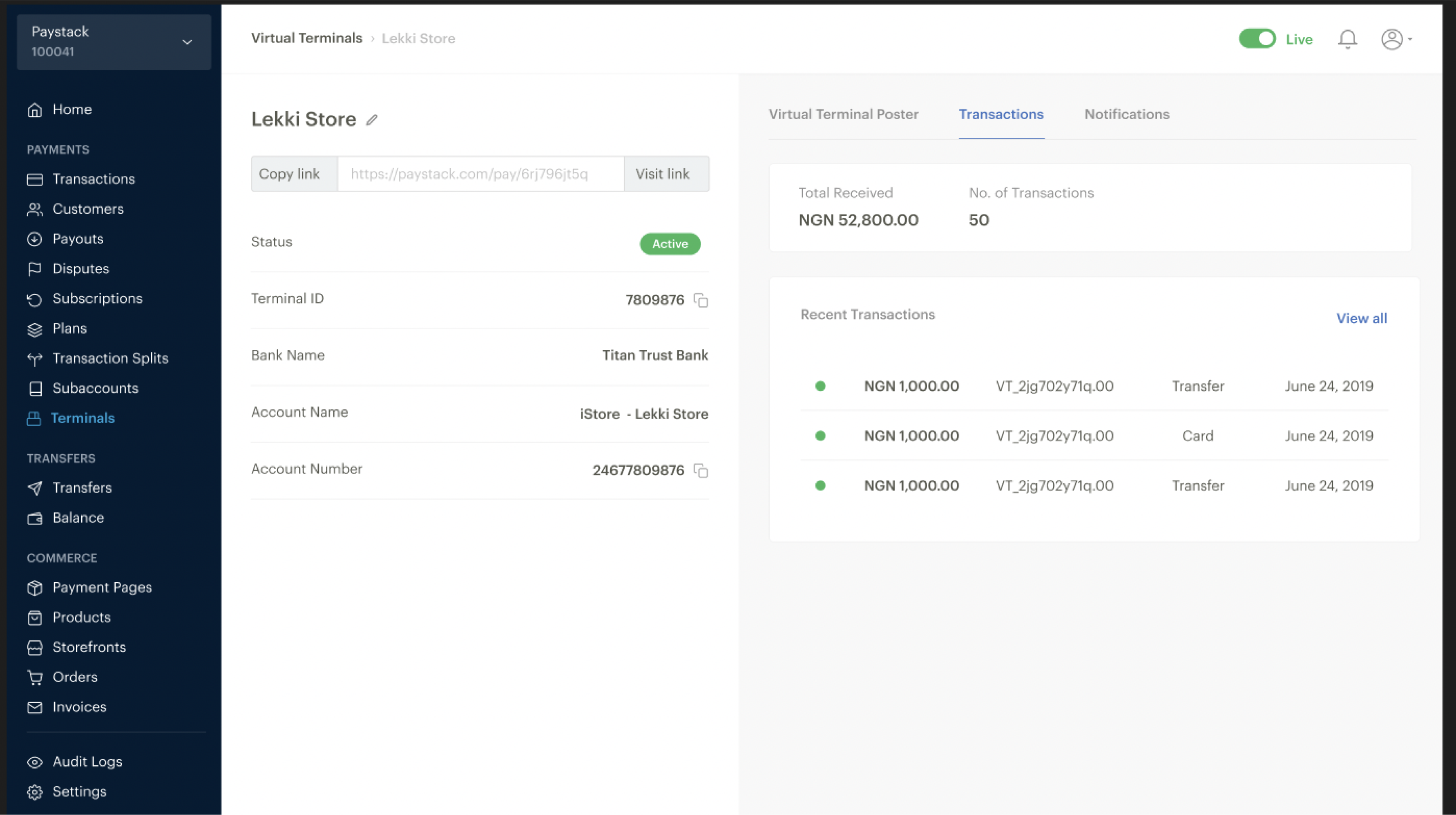
Transactions section showing a list of all transactions on the Virtual Terminal.
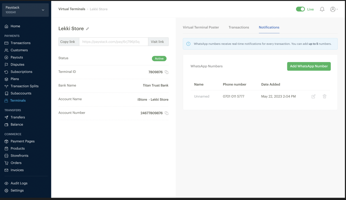
Notifications section to view, edit and delete WhatsApp numbers on a Virtual Terminal.
IMPACT
- Within six months, Virtual Terminal matched and exceeded the payment volume of physical POS devices, processing $2,000,000+ in monthly transactions. This demonstrated its effectiveness as a scalable alternative.
- Merchants gained the ability to accept international payments seamlessly, opening new revenue streams.
- Real-time WhatsApp notifications empowered merchants to respond quickly to transactions, reducing customer wait times and improving service delivery.
- Clear communication and intuitive design led to higher merchant adoption and satisfaction rates.
LESSONS
- I learned that the success of the product depended heavily on the iterative feedback we received from merchants. Each cycle of testing uncovered valuable insights that helped refine the final product.
- Clear, simple communication in both the UI copy and design choices was essential in building trust with merchants and ensuring the product’s usability.
- The project reinforced my belief in the importance of continuous iteration. Every small change, guided by real user feedback, contributed to a significantly better product.
CHECK OUT MY NEXT PROJECT
Panda
Designing “Canva for Paystack”
UX Research. Design.
Content guide