A case study on designing a self-serve system to scale Paystack’s Virtual Terminals.
ROLE
User research, UI design, Usability testing
TIMELINE
3 months
TOOLS
Figma, Figjam, Miro
OVERVIEW
In a 3-month project, I worked on a feature called Virtual Terminals that allowed a payment service provider to scale low-cost alternatives to physical POS devices for their merchants. During this project, I:
- Conducted user and stakeholder interviews
- Defined user flows
- Designed wireframes and high-fidelity prototypes
- Conducted usability tests to refine the solution
The result was a self serve dashboard that allowed the company to successfully scale and process $2m in monthly transactions.
CONTEXT
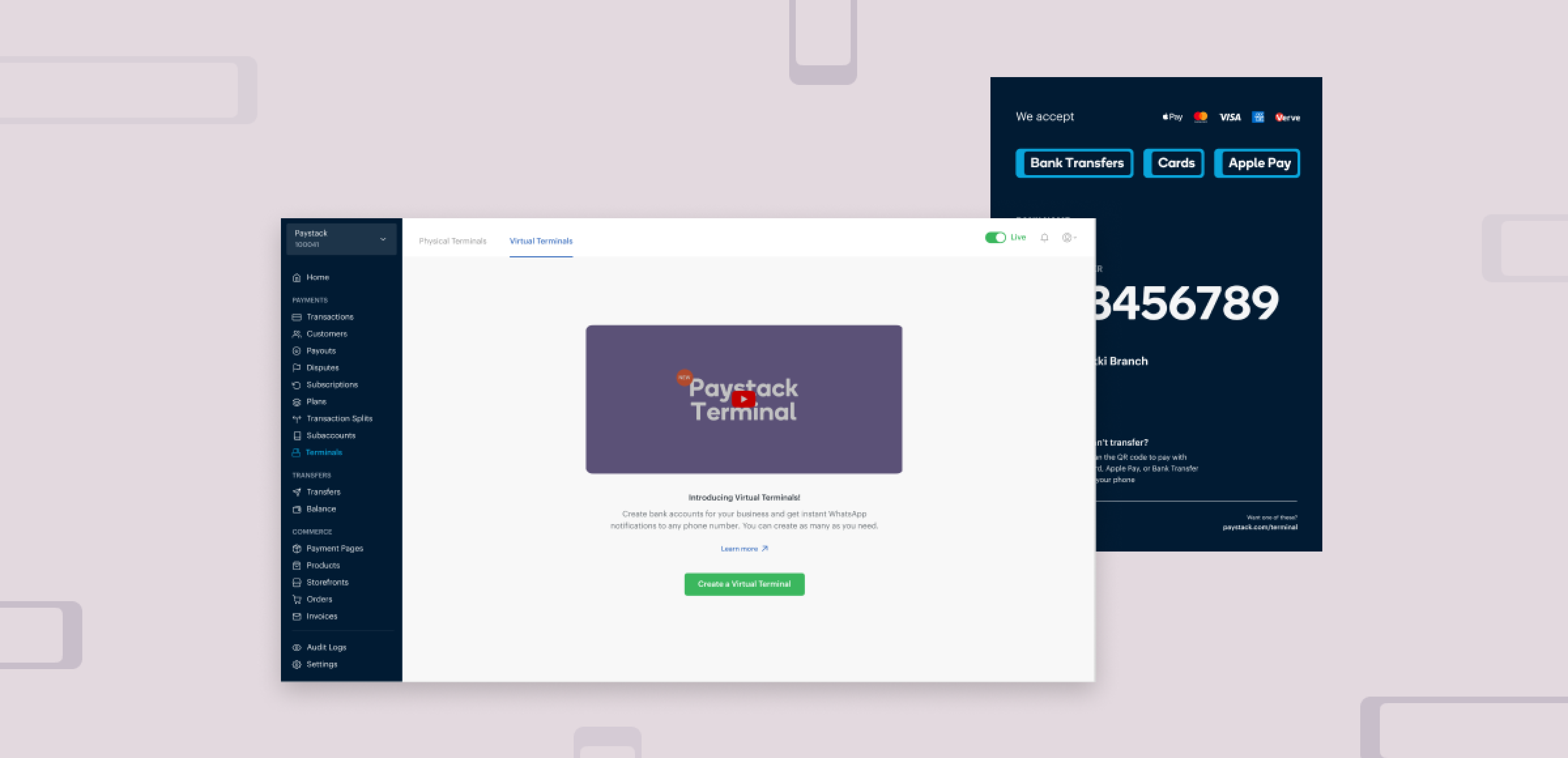
Paystack launched a pilot of Virtual Terminals, a simple way for merchants to accept in-person payments without hardware. The pilot was amazing, and merchants loved the low cost and the speed of transactions.
But there was one problem: the pilot was manual. Every Virtual Terminal had to be set up by Paystack staff, and merchants had to contact support if they wanted to update details like notification destinations.
This worked for a small test group, but to scale Virtual Terminals to tens of thousands of merchants, we needed to redesign the entire experience into a self-serve system where merchants could create, manage, and update their terminals independently.
UNDERSTANDING THE PROBLEM THROUGH RESEARCH
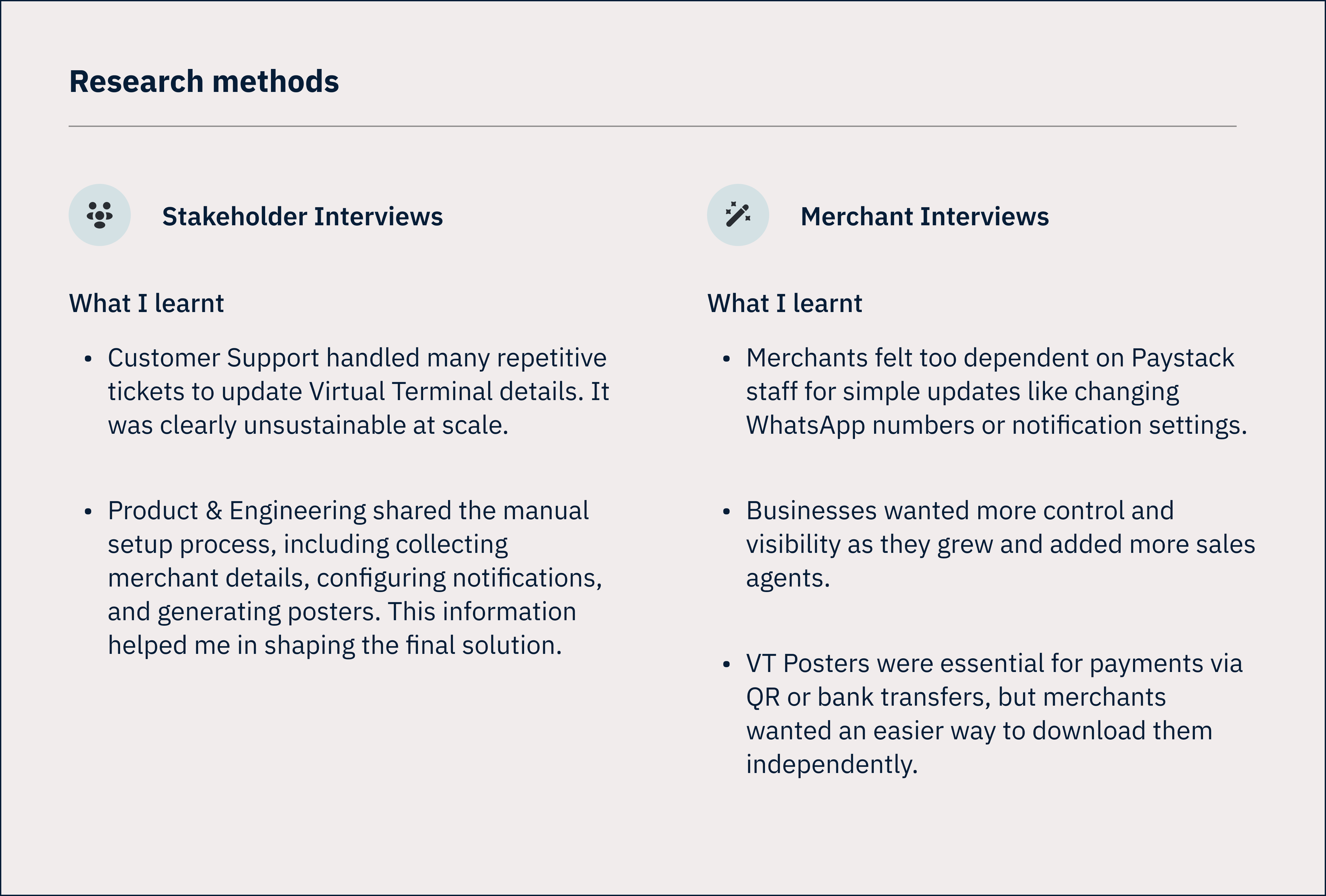
To better understand how the pilot had gone, what merchants needed, and what it would take to scale, I conducted:
- Stakeholder interviews with the Customer Support, Product, and Engineering teams.
- Merchant interviews with businesses who participated in the pilot.
GOALS
Based on the insights from the interviews and secondary research, I defined the goals for the project;
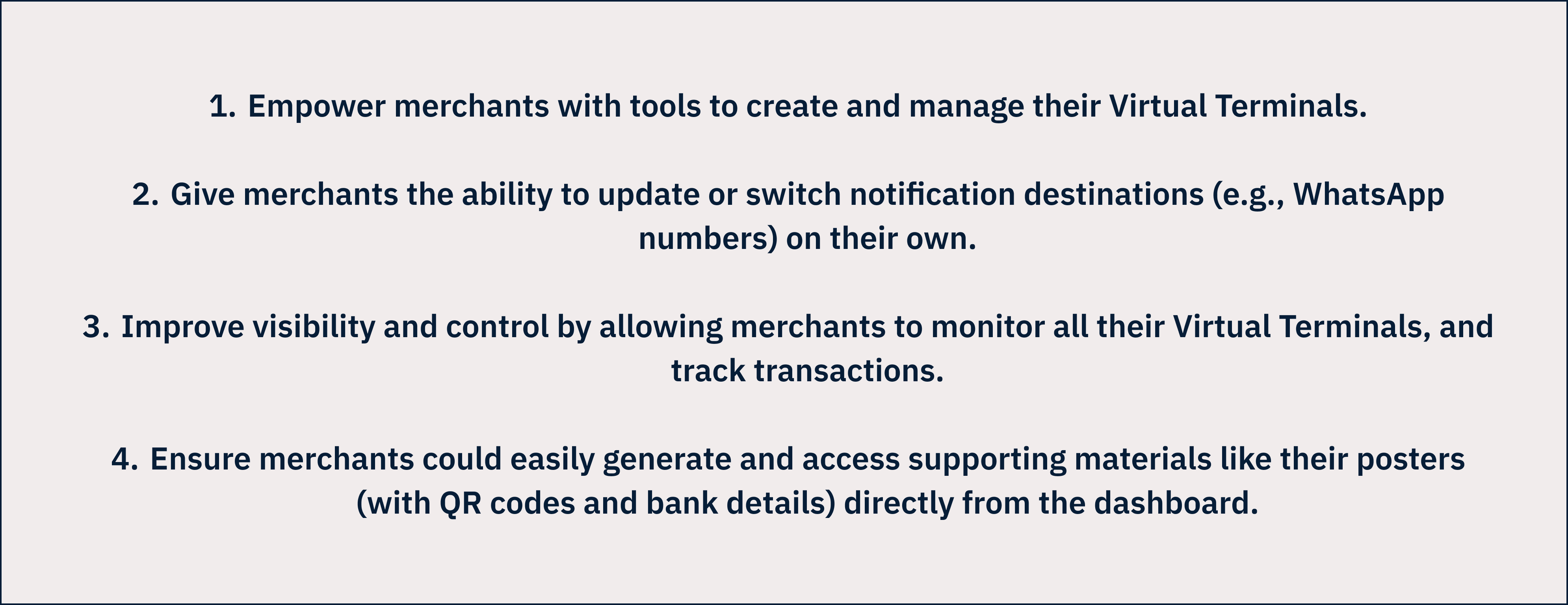
Goals for Virtual Terminals
USER FLOWS
After the research, I mapped the first version of the end-to-end merchant journey. My focus was on the paths for creating a Virtual Terminal, managing existing terminals, tracking transactions, and viewing, customising downloading a VT Poster
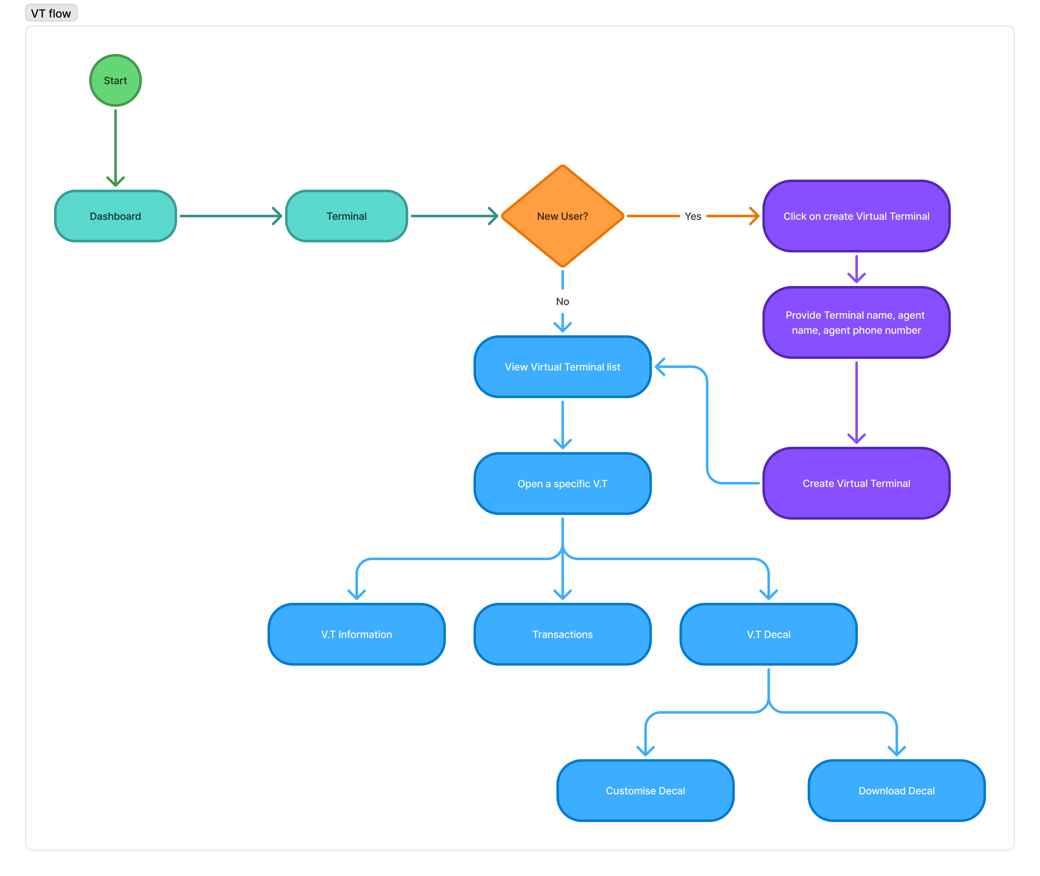
User flow for Virtual Terminals
With this user flow defined, I worked on the first iteration of the design.
For this project, I skipped low-fidelity wireframes. We were building on an existing, well-defined design system, so starting directly with high-fidelity wireframes helped us visualize real user flows faster and test interactions in a more realistic context.
1ST ITERATION
1st iteration of Virtual Terminals
TESTING & FEEDBACK
After designing the first iteration, I conducted usability testing sessions with some of our pilot merchants to validate the flow and uncover potential improvements.
Here’s what we learned:
- The initial design only supported a single phone number for receiving payment notifications. Merchants shared that this was restrictive as many of them had multiple sales agents who each needed real-time alerts. Based on this feedback, we expanded the feature to allow multiple notification numbers per terminal.
- We had initially explored giving merchants the option to upload their logos and customize poster colors. During testing, merchants told us that this level of customization wasn’t necessary. What they really wanted was a quick way to download ready-to-print posters in two formats (colored and black & white) that they could easily display at their sales points.
FINAL ITERATION
Based on the feedback, we refined the design to better reflect merchant needs:
- Added support for multiple WhatsApp notification numbers.
- Replaced customization with ready-to-use posters in color and black & white formats.
IMPACT
CHECK OUT MY NEXT PROJECT
GoLemon Misfits
Reducing food waste and business loss
Design. Strategy.
Content guide