Paystack (a payment processing company) previously launched a physical POS device, Terminal, allowing merchants to process in-person payments. While the device met many needs, several critical challenges emerged post-launch that limited merchant adoption and satisfaction:
1. High Costs:
Small businesses struggled to afford upfront device purchases, and large businesses found it costly to scale across many agents and sales points
2. Limited Payment Options:
The physical device did not support international card payments, restricting merchants from serving global customers.
3. Bank Transfer Inefficiencies:
Merchants who relied on bank transfers (due to device cost or coverage) faced substantial delays in transaction notifications, leading to longer customer wait times and operational frustrations.
Recognizing these barriers, Paystack aimed to create a low-cost, flexible alternative that could:
- Enable broad payment acceptance, including international cards and Apple Pay
- Increase transaction speed and visibility through instant notifications
- Remove hardware cost barriers and simplify scaling for merchants
TIMELINE
The project spanned 3–4 months from concept to launch, involving multiple iterations, user research phases, and usability testing cycles to refine the design.
ROLE
Product Designer
RESEARCH & USER INSIGHTS
To deeply understand merchant pain points and needs, I led and collaborated on a multi-phase research strategy:
- Conducted user interviews with merchants across industries and sizes, uncovering complexities in daily payment operations and challenges with device affordability.
- Led pilot testing sessions of early Virtual Terminal prototypes, collecting direct usability feedback and identifying moments of friction and confusion.
- Analyzed customer support tickets and online merchant feedback to triangulate common issues, including transaction delays and limited payment options.
- Synthesized insights into journey maps highlighting pain points like notification wait-times and multi-step payment flows.
From these findings, the key merchant needs emerged clearly:
- Speed & Clarity: Fast transaction processing with immediate payment confirmation.
- Payment Flexibility: Acceptance of multiple payment methods, especially international cards, to expand customer reach.
- Affordability & Simplicity: Easy onboarding without costly hardware or complicated setup.
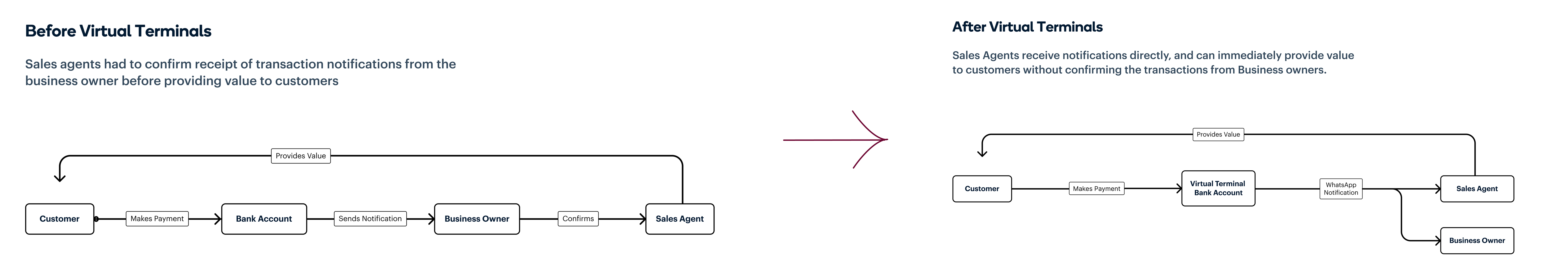
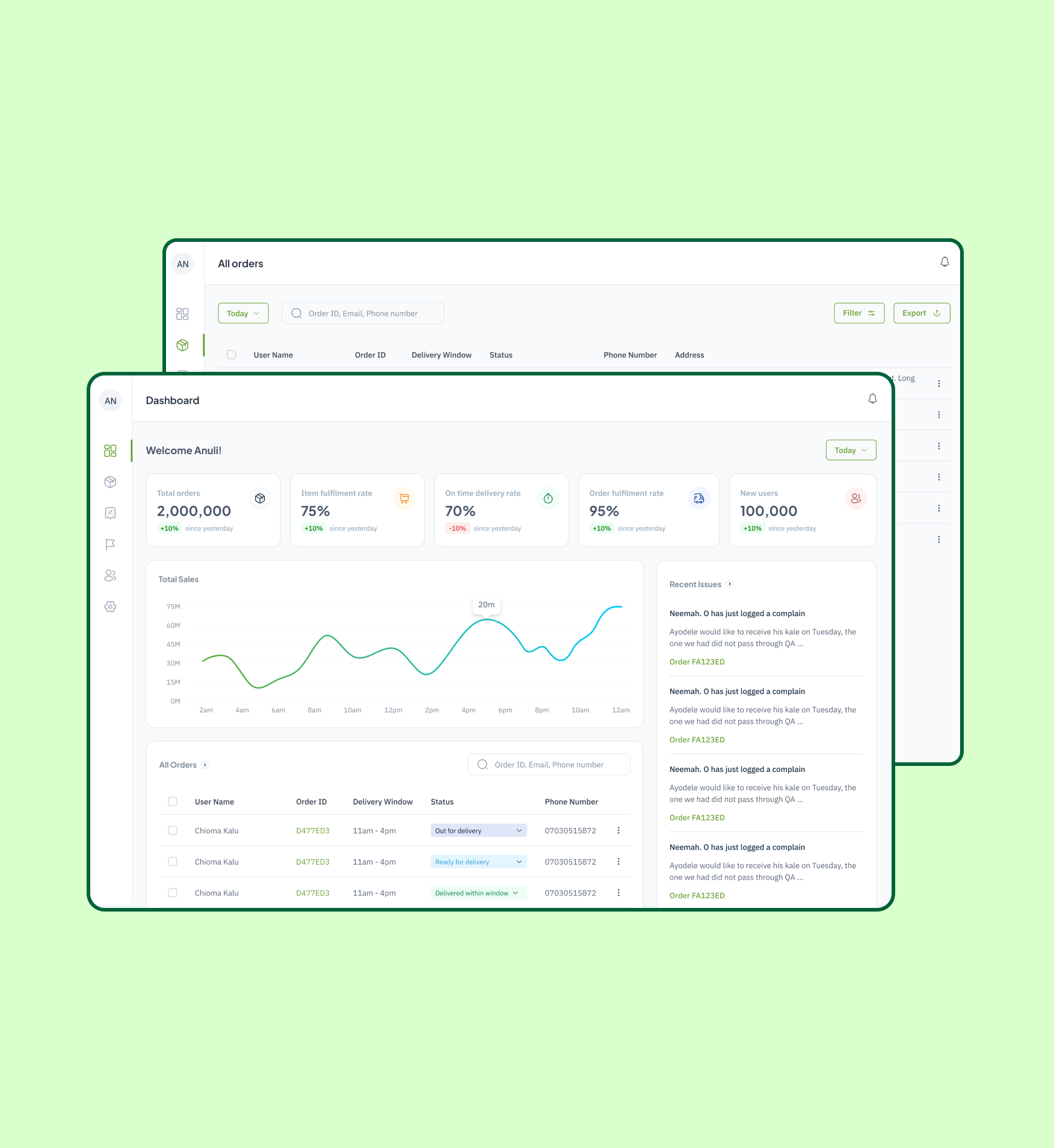
In person payment flow before and after Virtual Terminals
SOLUTION & DESIGN EXECUTION
To address the identified challenges, I facilitated cross-functional workshops with Product and Engineering teams, exploring multiple design directions until we arrived at a clear, user-centric solution. This solution was crafted and validated via multiple rounds of prototyping and usability testing using Figma.
- Streamlined Payment Flow
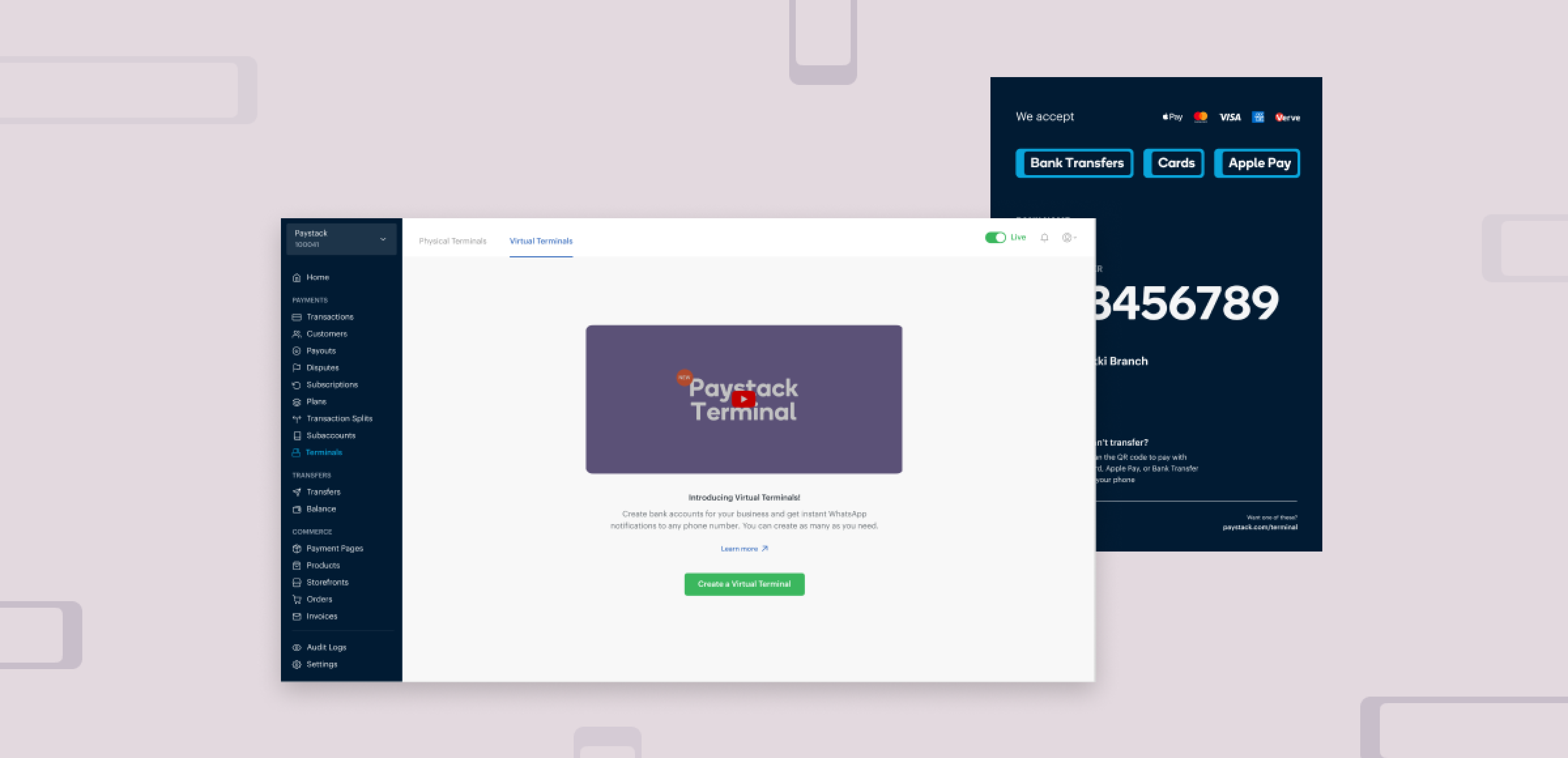
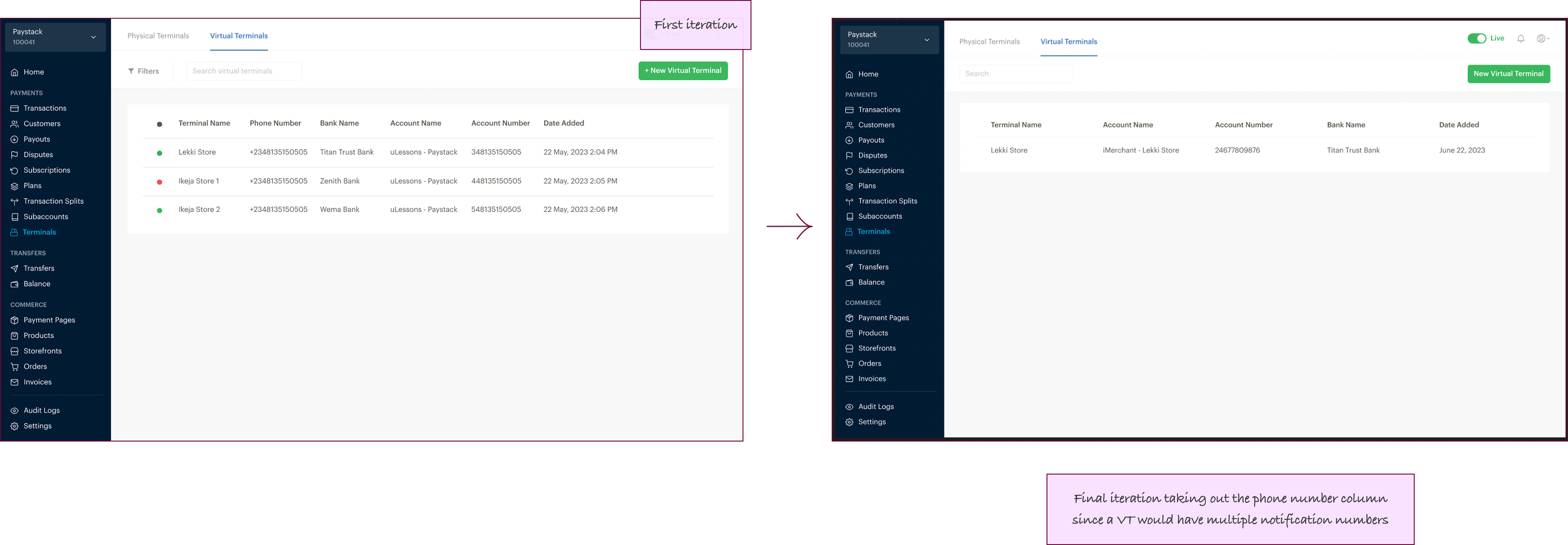
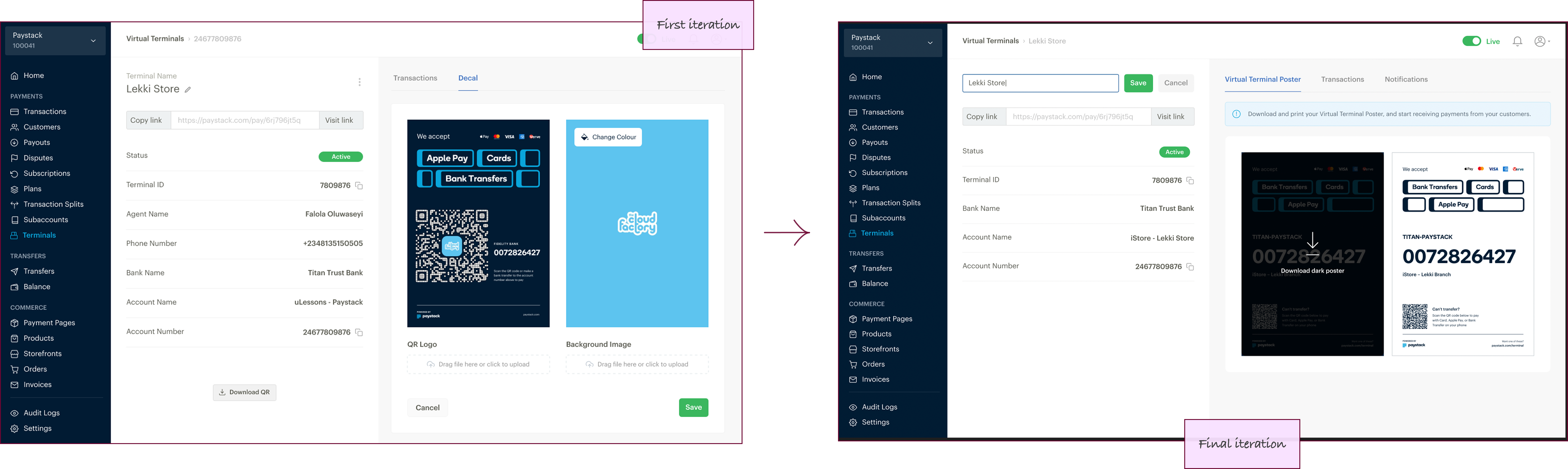
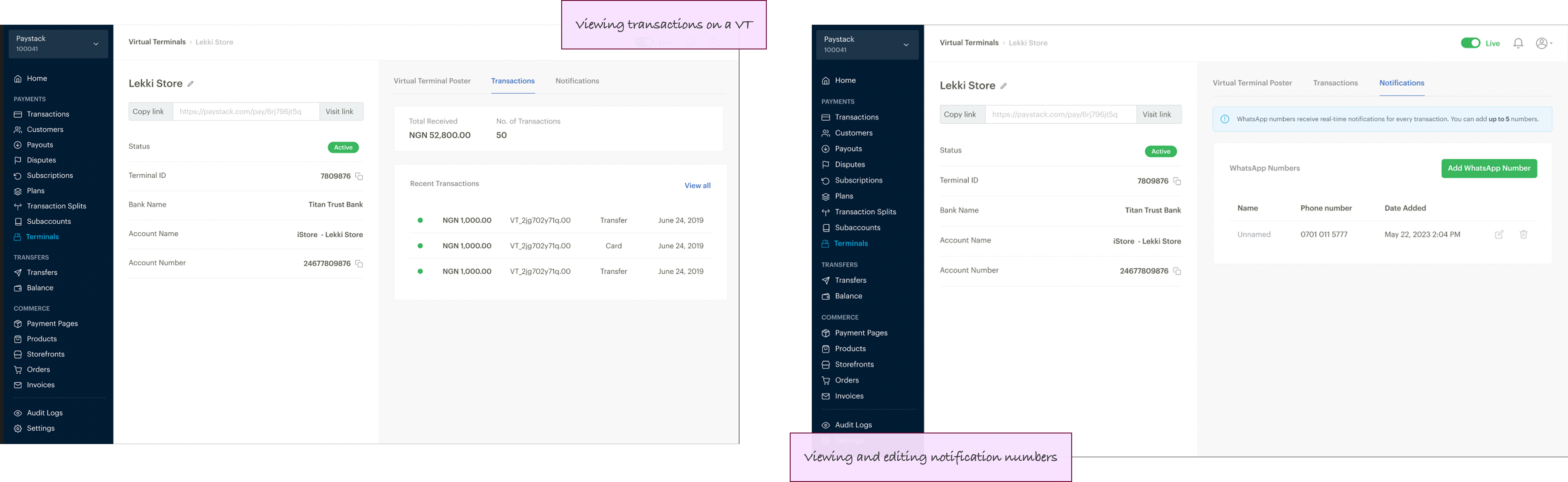
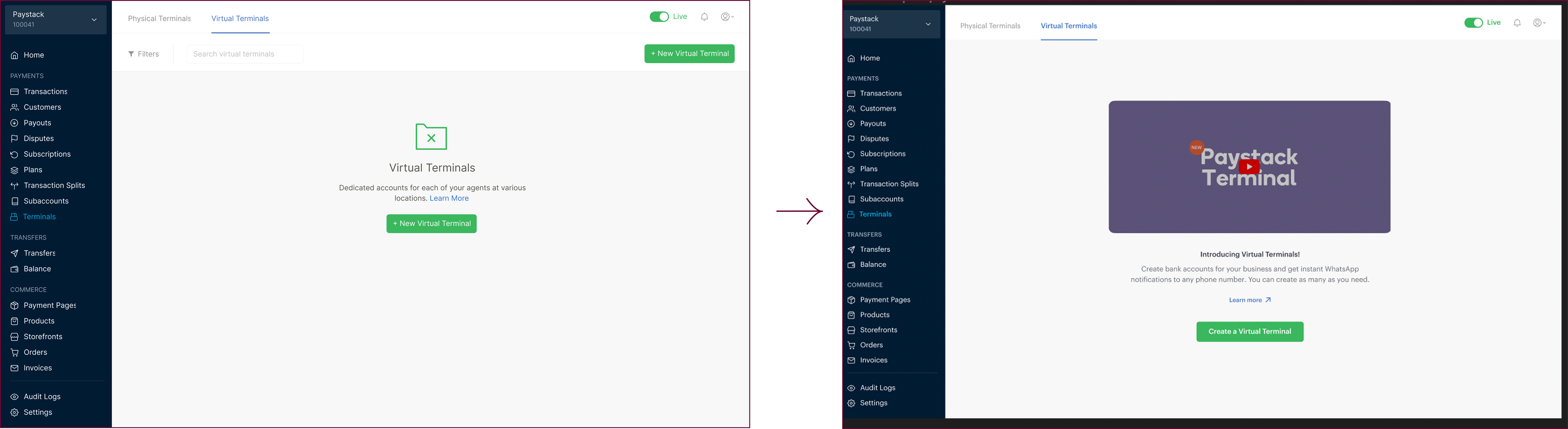
- Dashboard flow for creating and managing Virtual Terminals
- Flexible Payment Options
- Real-Time Notifications
- Poster Design Prioritization
- Accessibility & Usability
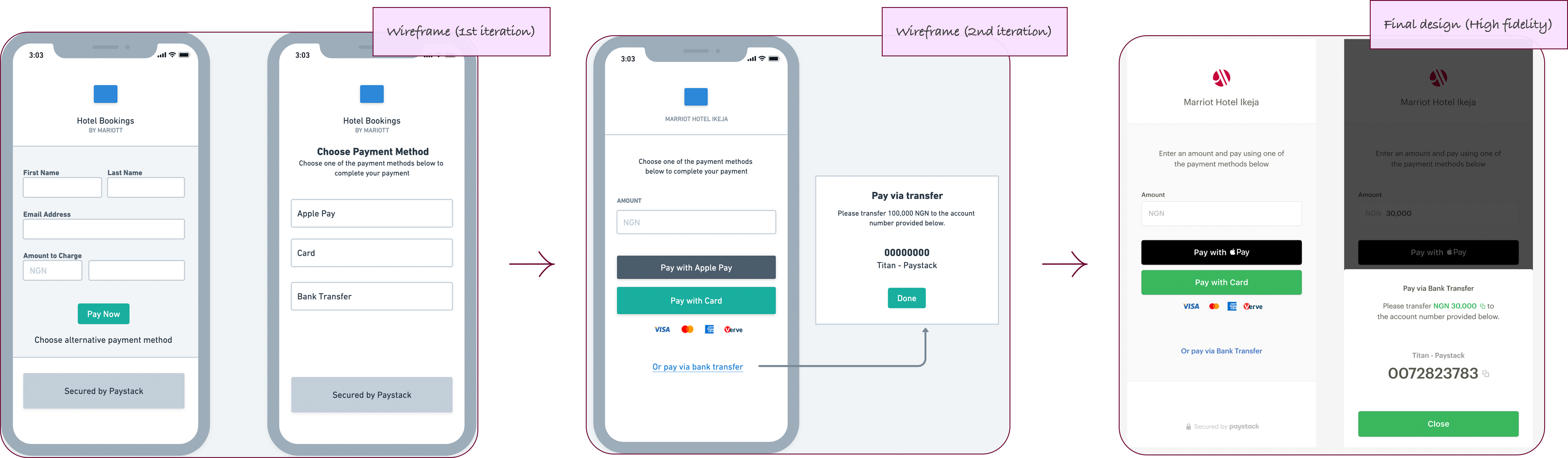
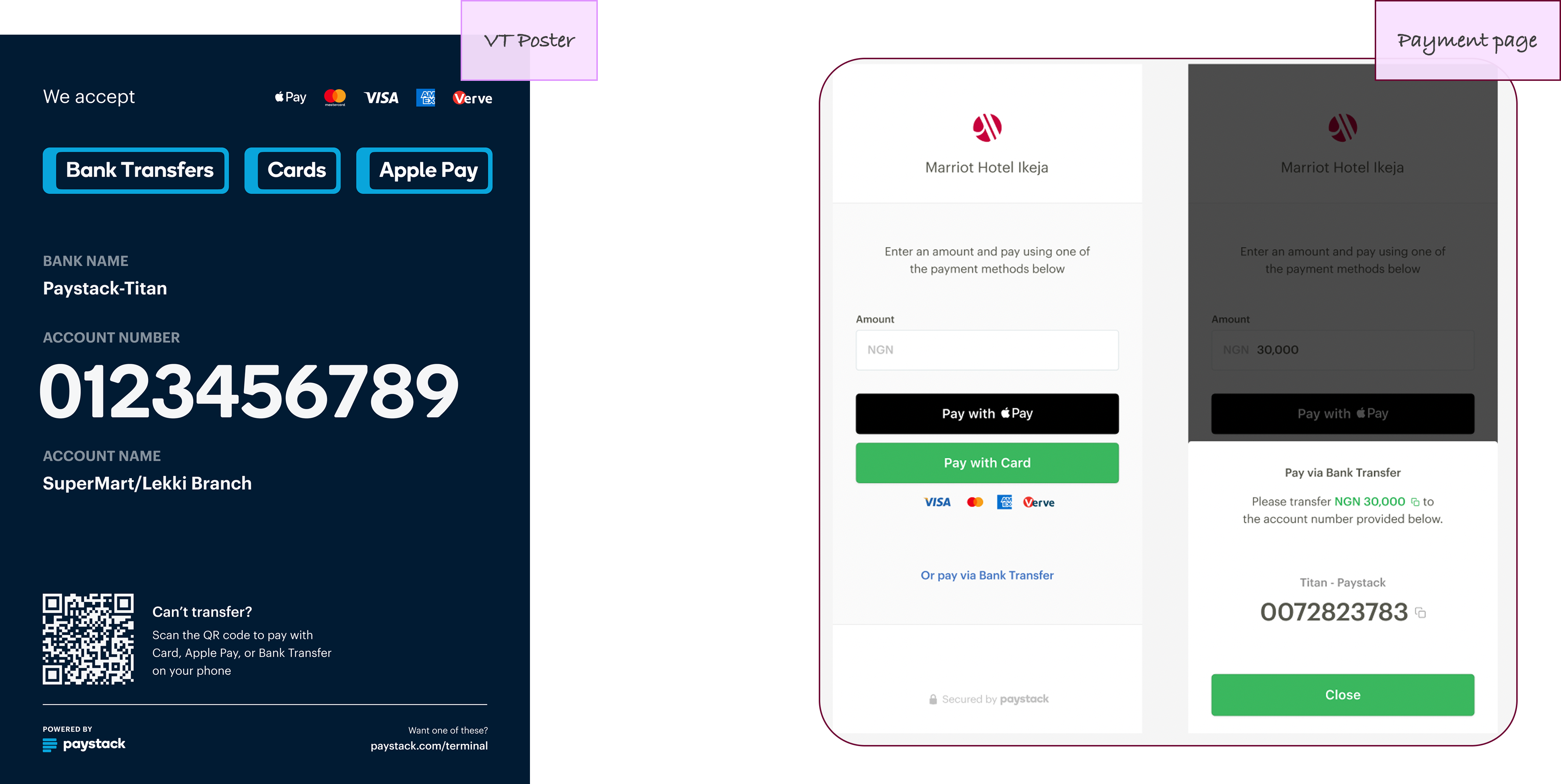
After different rounds of iterations, I transitioned from a 2-step to a 1-step payment process that enabled merchants to quickly enter amounts and select payment types on a single screen, reducing transaction time and cognitive load.
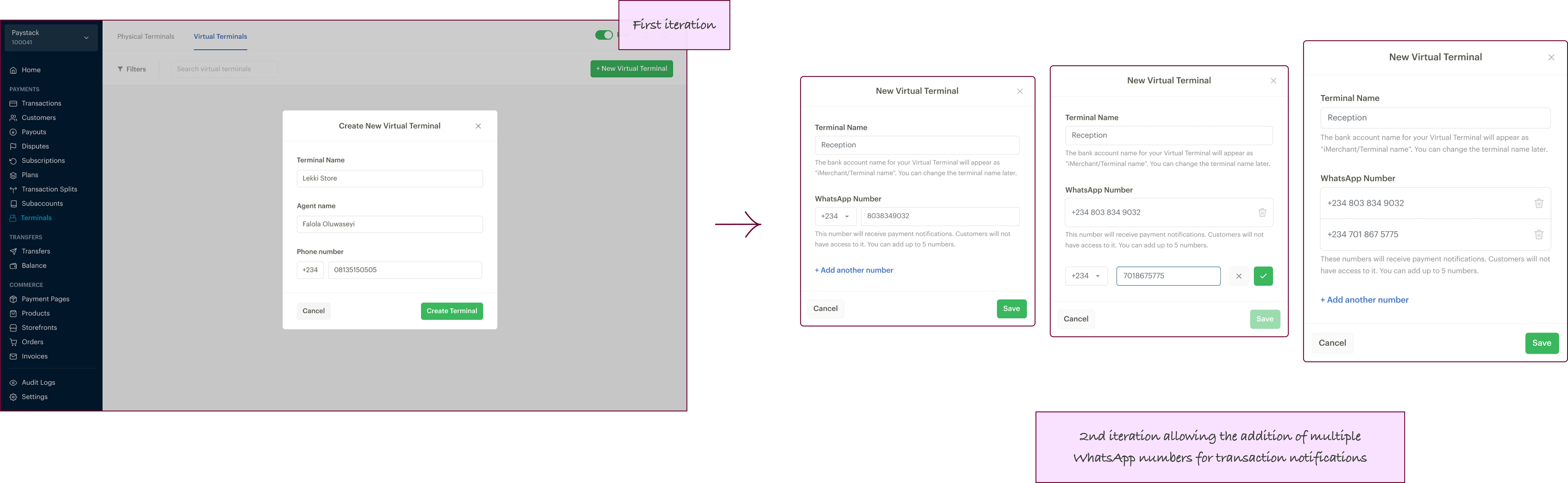
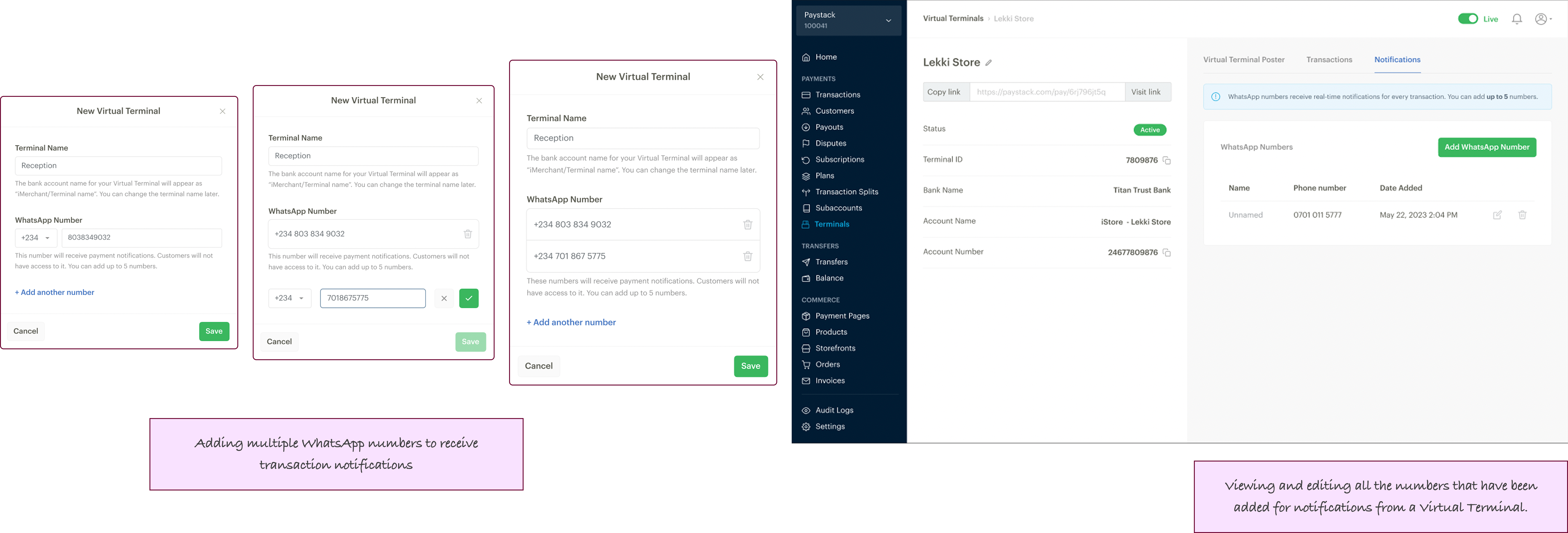
I designed components for virtual terminal creation, transaction tracking, and notification management, supporting increasing merchant complexity (e.g., allowing multiple WhatsApp numbers).
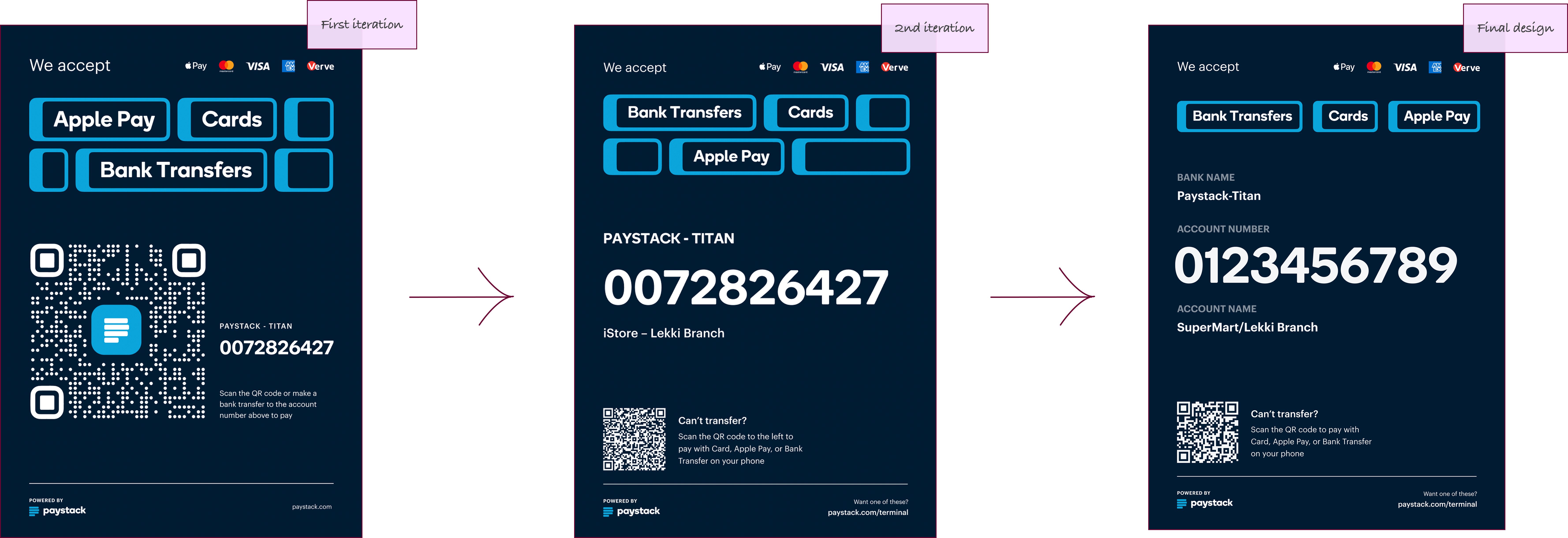
I designed the payment page and merchant poster to clearly display and support international cards, Apple Pay, bank transfers, and QR code payments.
I partnered with the engineering team to integrate WhatsApp notifications for instant transaction alerts, empowering merchants to respond rapidly and improve customer experience.
Based on feedback, I iterated the merchant poster to emphasize the most-used bank account channels over QR codes, improving clarity and payment success rates.
I ensured UI components met WCAG 2.1 accessibility standards, and included microcopy and visual cues in the empty state design to ease onboarding and reduce errors.
CHALLENGES
Balancing Feature Scope with Usability:
During the pilot, merchants requested many features that risked creating feature bloat and complicating the user experience. We held prioritization workshops to focus on the most valuable additions, ensuring the product remained intuitive and met core merchant needs without unnecessary complexity.
Technical Constraints on Real-Time Notifications:
Integrating WhatsApp notifications at scale posed backend complexities. Regular syncs with engineering allowed us to align UI expectations with feasible tech solutions, adjusting designs where necessary while advocating for merchant value.
Poster Design Hierarchy Shifts:
Initial designs emphasized QR codes, but user feedback favored bank details. Pivoting required quick iterations and clear communication with users and other stakeholders.
Remote Collaboration Dynamics:
Operating in cross-functional, remote teams meant communication delays and limited spontaneous feedback. I proactively scheduled regular check-ins and shared clear design documentation, ensuring alignment with all team members.
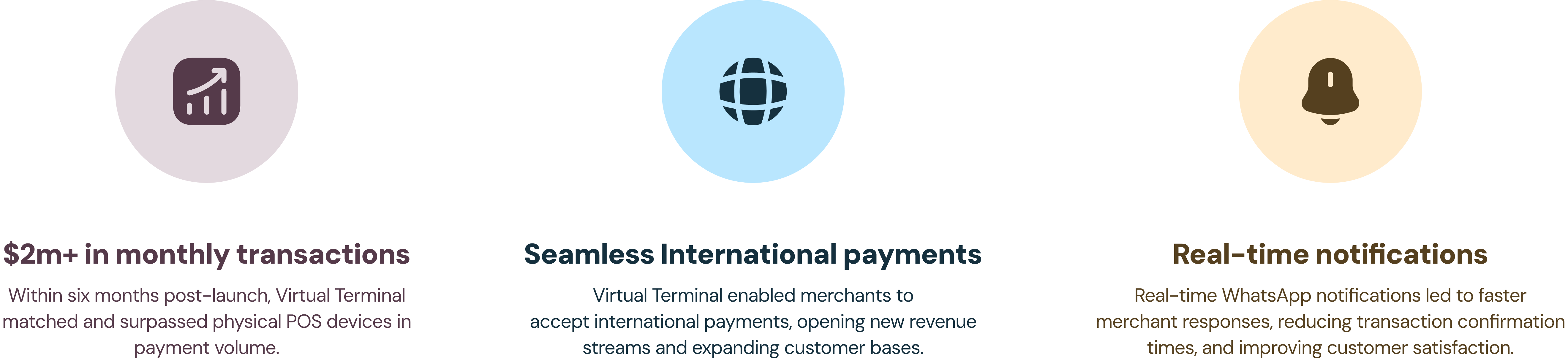
IMPACT
LESSONS
- I learned that the success of the product depended heavily on the iterative feedback we received from merchants. Each cycle of testing uncovered valuable insights that helped refine the final product.
- Clear, simple communication in both the UI copy and design choices was essential in building trust with merchants and ensuring the product’s usability.
- The project reinforced my belief in the importance of continuous iteration. Every small change, guided by real user feedback, contributed to a significantly better product.
CHECK OUT MY NEXT PROJECT
Limelight
Driving efficiency in order fulfilment
Design. Research. Strategy.
Content guide